Session 2: Homework 1
Rents in San Francisco 2000-2018
# download directly off tidytuesdaygithub repo

rent <- readr::read_csv('https://raw.githubusercontent.com/rfordatascience/tidytuesday/master/data/2022/2022-07-05/rent.csv')
What are the variable types? Do they all correspond to what they really are? Which variables have most missing values?
The variable types are: character(chr), integer(int), double(dbl). The data type for date is ‘double’ but it should be ‘date’. The column description seems to have the most missing values.
skimr::skim(rent)| Name | rent |
| Number of rows | 200796 |
| Number of columns | 17 |
| _______________________ | |
| Column type frequency: | |
| character | 8 |
| numeric | 9 |
| ________________________ | |
| Group variables | None |
Variable type: character
| skim_variable | n_missing | complete_rate | min | max | empty | n_unique | whitespace |
|---|---|---|---|---|---|---|---|
| post_id | 0 | 1.00 | 9 | 14 | 0 | 200796 | 0 |
| nhood | 0 | 1.00 | 4 | 43 | 0 | 167 | 0 |
| city | 0 | 1.00 | 5 | 19 | 0 | 104 | 0 |
| county | 1394 | 0.99 | 4 | 13 | 0 | 10 | 0 |
| address | 196888 | 0.02 | 1 | 38 | 0 | 2869 | 0 |
| title | 2517 | 0.99 | 2 | 298 | 0 | 184961 | 0 |
| descr | 197542 | 0.02 | 13 | 16975 | 0 | 3025 | 0 |
| details | 192780 | 0.04 | 4 | 595 | 0 | 7667 | 0 |
Variable type: numeric
| skim_variable | n_missing | complete_rate | mean | sd | p0 | p25 | p50 | p75 | p100 | hist |
|---|---|---|---|---|---|---|---|---|---|---|
| date | 0 | 1.00 | 2.01e+07 | 44694.07 | 2.00e+07 | 2.01e+07 | 2.01e+07 | 2.01e+07 | 2.02e+07 | ▁▇▁▆▃ |
| year | 0 | 1.00 | 2.01e+03 | 4.48 | 2.00e+03 | 2.00e+03 | 2.01e+03 | 2.01e+03 | 2.02e+03 | ▁▇▁▆▃ |
| price | 0 | 1.00 | 2.14e+03 | 1427.75 | 2.20e+02 | 1.30e+03 | 1.80e+03 | 2.50e+03 | 4.00e+04 | ▇▁▁▁▁ |
| beds | 6608 | 0.97 | 1.89e+00 | 1.08 | 0.00e+00 | 1.00e+00 | 2.00e+00 | 3.00e+00 | 1.20e+01 | ▇▂▁▁▁ |
| baths | 158121 | 0.21 | 1.68e+00 | 0.69 | 1.00e+00 | 1.00e+00 | 2.00e+00 | 2.00e+00 | 8.00e+00 | ▇▁▁▁▁ |
| sqft | 136117 | 0.32 | 1.20e+03 | 5000.22 | 8.00e+01 | 7.50e+02 | 1.00e+03 | 1.36e+03 | 9.00e+05 | ▇▁▁▁▁ |
| room_in_apt | 0 | 1.00 | 0.00e+00 | 0.04 | 0.00e+00 | 0.00e+00 | 0.00e+00 | 0.00e+00 | 1.00e+00 | ▇▁▁▁▁ |
| lat | 193145 | 0.04 | 3.77e+01 | 0.35 | 3.36e+01 | 3.74e+01 | 3.78e+01 | 3.78e+01 | 4.04e+01 | ▁▁▅▇▁ |
| lon | 196484 | 0.02 | -1.22e+02 | 0.78 | -1.23e+02 | -1.22e+02 | -1.22e+02 | -1.22e+02 | -7.42e+01 | ▇▁▁▁▁ |
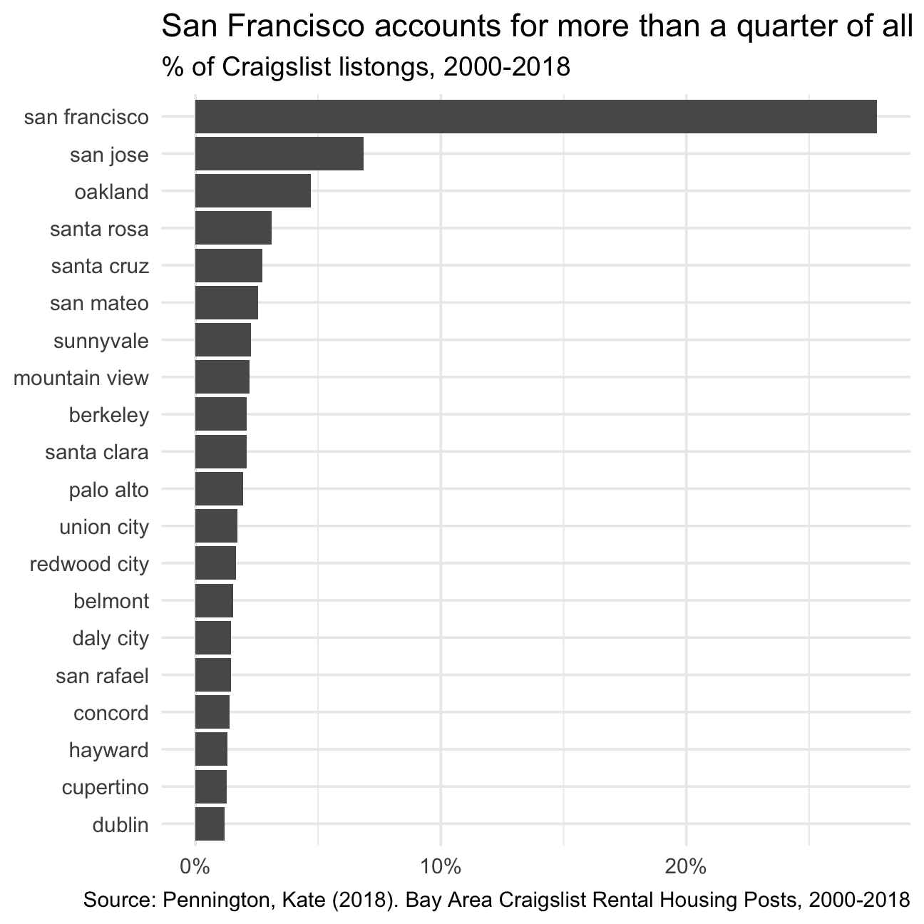
rent %>%
  count(city, sort=TRUE) %>%
  mutate(prop = n/sum(n)) %>%
  slice_max(prop, n=20) %>%
  mutate(city = fct_reorder(city, prop)) %>%
  ggplot(aes(x=city, y = prop)) +
  coord_flip() +
  geom_col() +
  theme_minimal(base_size=14) +
  scale_y_continuous(labels = scales::percent) +
  labs(
    title="San Francisco accounts for more than a quarter of all rental classifieds",
    subtitle="% of Craigslist listongs, 2000-2018",
    caption = "Source: Pennington, Kate (2018). Bay Area Craigslist Rental Housing Posts, 2000-2018",
    x=NULL,
    y=NULL
    )
by_year_sf <- rent %>%
  filter(city == "san francisco") %>%
  group_by(year, beds) %>%
  summarize(median_price = median(price))

by_year_sf %>%
  filter(beds <=3) %>%
  ggplot(aes(x=year, y=median_price, colour = factor(beds))) +
  geom_line() +
  labs(title='San Francisco rents have been steadily increasing', subtitle='0 to 3-bed listings, 2000-2008', caption='Source:Pennington, Kate (2018). Bay Area Craigslist Rental Housing Posts, 2000-2018', x='Years', y='Median Prices') +
  theme(legend.position = "none") +
  facet_wrap(~beds, nrow=1)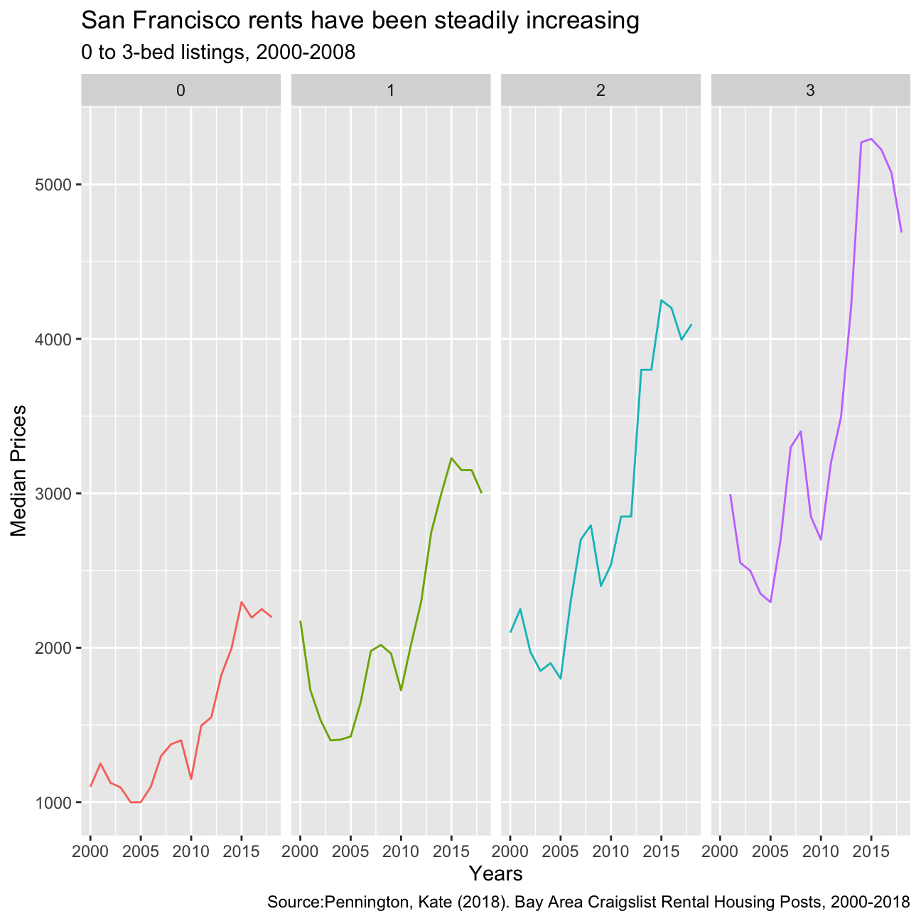
list_of_top_12_cities=rent %>%
  count(city, sort=TRUE) %>%
  mutate(prop = n/sum(n)) %>%
  slice_max(prop, n=12) %>%
  mutate(city = fct_reorder(city, prop))

list_of_rent_for_top_12_cities=
  left_join(list_of_top_12_cities,rent,by="city")


list_of_rent_for_top_12_cities %>%
  filter(beds==1) %>%
  group_by(city,year) %>%
  summarise(median=median(price)) %>%
  ggplot(aes(x=year,y=median, color=city))+geom_line()+
   labs(title='Rental prices for 1-bedroom flats in the bay area', caption='Source:Pennington, Kate (2018). Bay Area Craigslist Rental Housing Posts, 2000-2018', x='Years', y='Median Prices') +
  theme(legend.position = "none") +
  facet_wrap(~city)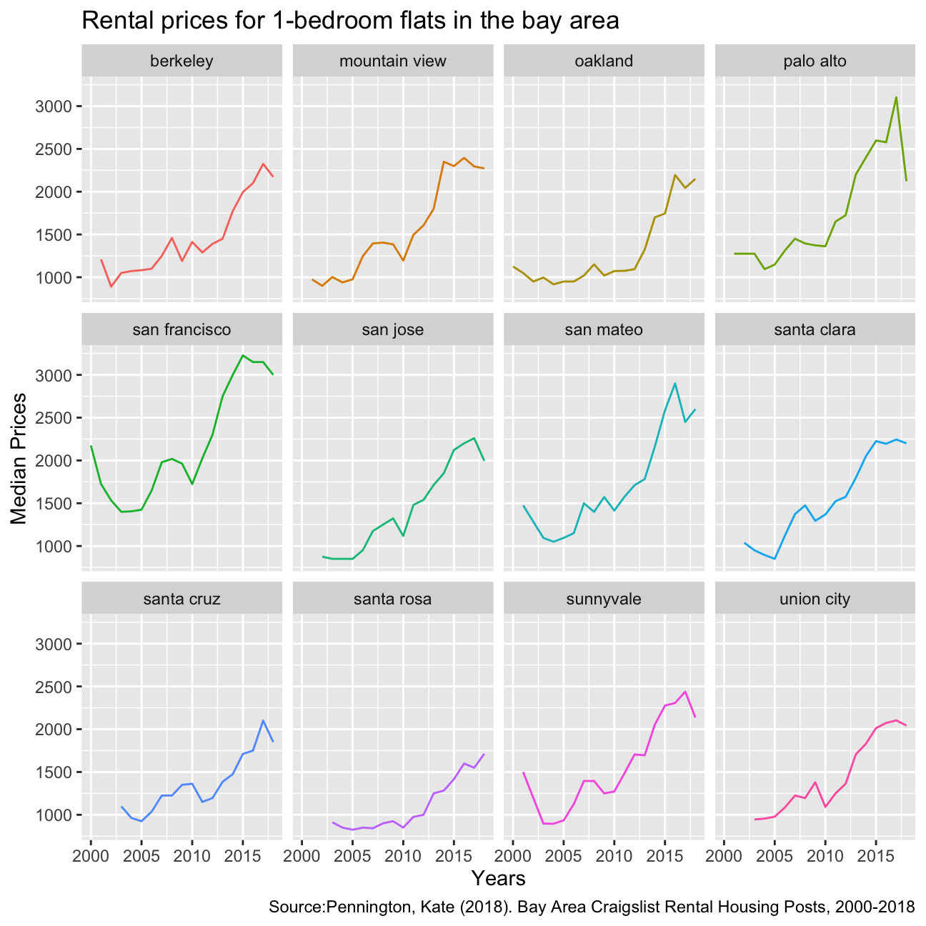
There is an overall increase in the median rental price among all these 12 cities in the Bay Area. San Francisco had experienced the highest median rental prices and most steep trend in the 18 years. This could be due to the boom in the tech industry in the bay area in the past few years, resulting in an overall increase in rental prices as more people moved into the area.
Analysis of movies- IMDB dataset
We will look at a subset sample of movies, taken from the Kaggle IMDB 5000 movie dataset
movies <- read_csv(here::here("data", "movies.csv"))
glimpse(movies)
## Rows: 2,961
## Columns: 11
## $ title <chr> "Avatar", "Titanic", "Jurassic World", "The Avenge…
## $ genre <chr> "Action", "Drama", "Action", "Action", "Action", "…
## $ director <chr> "James Cameron", "James Cameron", "Colin Trevorrow…
## $ year <dbl> 2009, 1997, 2015, 2012, 2008, 1999, 1977, 2015, 20…
## $ duration <dbl> 178, 194, 124, 173, 152, 136, 125, 141, 164, 93, 1…
## $ gross <dbl> 7.61e+08, 6.59e+08, 6.52e+08, 6.23e+08, 5.33e+08, …
## $ budget <dbl> 2.37e+08, 2.00e+08, 1.50e+08, 2.20e+08, 1.85e+08, …
## $ cast_facebook_likes <dbl> 4834, 45223, 8458, 87697, 57802, 37723, 13485, 920…
## $ votes <dbl> 886204, 793059, 418214, 995415, 1676169, 534658, 9…
## $ reviews <dbl> 3777, 2843, 1934, 2425, 5312, 3917, 1752, 1752, 35…
## $ rating <dbl> 7.9, 7.7, 7.0, 8.1, 9.0, 6.5, 8.7, 7.5, 8.5, 7.2, …Besides the obvious variables of title, genre, director, year, and duration, the rest of the variables are as follows:
gross: The gross earnings in the US box office, not adjusted for inflationbudget: The movie’s budgetcast_facebook_likes: the number of facebook likes cast memebrs receivedvotes: the number of people who voted for (or rated) the movie in IMDBreviews: the number of reviews for that movierating: IMDB average rating
Use your data import, inspection, and cleaning skills to answer the following:
- Are there any missing values (NAs)? Are all entries distinct or are there duplicate entries?
There are no missing values, we can check this using the following code:
skim(movies)| Name | movies |
| Number of rows | 2961 |
| Number of columns | 11 |
| _______________________ | |
| Column type frequency: | |
| character | 3 |
| numeric | 8 |
| ________________________ | |
| Group variables | None |
Variable type: character
| skim_variable | n_missing | complete_rate | min | max | empty | n_unique | whitespace |
|---|---|---|---|---|---|---|---|
| title | 0 | 1 | 1 | 83 | 0 | 2907 | 0 |
| genre | 0 | 1 | 5 | 11 | 0 | 17 | 0 |
| director | 0 | 1 | 3 | 32 | 0 | 1366 | 0 |
Variable type: numeric
| skim_variable | n_missing | complete_rate | mean | sd | p0 | p25 | p50 | p75 | p100 | hist |
|---|---|---|---|---|---|---|---|---|---|---|
| year | 0 | 1 | 2.00e+03 | 9.95e+00 | 1920.0 | 2.00e+03 | 2.00e+03 | 2.01e+03 | 2.02e+03 | ▁▁▁▂▇ |
| duration | 0 | 1 | 1.10e+02 | 2.22e+01 | 37.0 | 9.50e+01 | 1.06e+02 | 1.19e+02 | 3.30e+02 | ▃▇▁▁▁ |
| gross | 0 | 1 | 5.81e+07 | 7.25e+07 | 703.0 | 1.23e+07 | 3.47e+07 | 7.56e+07 | 7.61e+08 | ▇▁▁▁▁ |
| budget | 0 | 1 | 4.06e+07 | 4.37e+07 | 218.0 | 1.10e+07 | 2.60e+07 | 5.50e+07 | 3.00e+08 | ▇▂▁▁▁ |
| cast_facebook_likes | 0 | 1 | 1.24e+04 | 2.05e+04 | 0.0 | 2.24e+03 | 4.60e+03 | 1.69e+04 | 6.57e+05 | ▇▁▁▁▁ |
| votes | 0 | 1 | 1.09e+05 | 1.58e+05 | 5.0 | 1.99e+04 | 5.57e+04 | 1.33e+05 | 1.69e+06 | ▇▁▁▁▁ |
| reviews | 0 | 1 | 5.03e+02 | 4.94e+02 | 2.0 | 1.99e+02 | 3.64e+02 | 6.31e+02 | 5.31e+03 | ▇▁▁▁▁ |
| rating | 0 | 1 | 6.39e+00 | 1.05e+00 | 1.6 | 5.80e+00 | 6.50e+00 | 7.10e+00 | 9.30e+00 | ▁▁▆▇▁ |
There are 2961 observations, all unique:
count(movies) == n_distinct(movies)## n
## [1,] TRUE- Produce a table with the count of movies by genre, ranked in descending order
movies %>%
  group_by(genre) %>%
  summarise(count_genre = count(genre)) %>%
  arrange(desc(count_genre))
## # A tibble: 17 × 2
## genre count_genre
## <chr> <int>
## 1 Comedy 848
## 2 Action 738
## 3 Drama 498
## 4 Adventure 288
## 5 Crime 202
## 6 Biography 135
## 7 Horror 131
## 8 Animation 35
## 9 Fantasy 28
## 10 Documentary 25
## 11 Mystery 16
## 12 Sci-Fi 7
## 13 Family 3
## 14 Musical 2
## 15 Romance 2
## 16 Western 2
## 17 Thriller 1- Produce a table with the average gross earning and budget (
grossandbudget) by genre. Calculate a variablereturn_on_budgetwhich shows how many $ did a movie make at the box office for each $ of its budget. Ranked genres by thisreturn_on_budgetin descending order
movies %>%
  group_by(genre) %>%
  summarise(mean_gross = mean(gross), mean_budget = mean(budget)) %>%
  mutate(return_on_budget = mean_gross/mean_budget) %>%
  arrange(desc(return_on_budget))
## # A tibble: 17 × 4
## genre mean_gross mean_budget return_on_budget
## <chr> <dbl> <dbl> <dbl>
## 1 Musical 92084000 3189500 28.9
## 2 Family 149160478. 14833333. 10.1
## 3 Western 20821884 3465000 6.01
## 4 Documentary 17353973. 5887852. 2.95
## 5 Horror 37713738. 13504916. 2.79
## 6 Fantasy 42408841. 17582143. 2.41
## 7 Comedy 42630552. 24446319. 1.74
## 8 Mystery 67533021. 39218750 1.72
## 9 Animation 98433792. 61701429. 1.60
## 10 Biography 45201805. 28543696. 1.58
## 11 Adventure 95794257. 66290069. 1.45
## 12 Drama 37465371. 26242933. 1.43
## 13 Crime 37502397. 26596169. 1.41
## 14 Romance 31264848. 25107500 1.25
## 15 Action 86583860. 71354888. 1.21
## 16 Sci-Fi 29788371. 27607143. 1.08
## 17 Thriller 2468 300000 0.00823- Produce a table that shows the top 15 directors who have created the highest gross revenue in the box office. Don’t just show the total gross amount, but also the mean, median, and standard deviation per director.
movies %>%
  group_by(director) %>%
  summarise(total_gross = sum(gross),
            mean_gross = mean(gross),
            med_gross = median(gross),
            sd_gross = sd(gross)) %>%
  slice_max(total_gross, n=15)
## # A tibble: 15 × 5
## director total_gross mean_gross med_gross sd_gross
## <chr> <dbl> <dbl> <dbl> <dbl>
## 1 Steven Spielberg 4014061704 174524422. 164435221 101421051.
## 2 Michael Bay 2231242537 171634041. 138396624 127161579.
## 3 Tim Burton 2071275480 129454718. 76519172 108726924.
## 4 Sam Raimi 2014600898 201460090. 234903076 162126632.
## 5 James Cameron 1909725910 318287652. 175562880. 309171337.
## 6 Christopher Nolan 1813227576 226653447 196667606. 187224133.
## 7 George Lucas 1741418480 348283696 380262555 146193880.
## 8 Robert Zemeckis 1619309108 124562239. 100853835 91300279.
## 9 Clint Eastwood 1378321100 72543216. 46700000 75487408.
## 10 Francis Lawrence 1358501971 271700394. 281666058 135437020.
## 11 Ron Howard 1335988092 111332341 101587923 81933761.
## 12 Gore Verbinski 1329600995 189942999. 123207194 154473822.
## 13 Andrew Adamson 1137446920 284361730 279680930. 120895765.
## 14 Shawn Levy 1129750988 102704635. 85463309 65484773.
## 15 Ridley Scott 1128857598 80632686. 47775715 68812285.- Finally, ratings. Produce a table that describes how ratings are distributed by genre. We don’t want just the mean, but also, min, max, median, SD and some kind of a histogram or density graph that visually shows how ratings are distributed.
# TABLE WITH SUMMARY STATISTICS
movies %>%
  group_by(genre) %>%
  summarise(mean_rating  = mean(rating),
            min_rating   = min(rating),
            max_rating   = max(rating),
            med_rating   = median(rating),
            sd_rating    = sd(rating))
## # A tibble: 17 × 6
## genre mean_rating min_rating max_rating med_rating sd_rating
## <chr> <dbl> <dbl> <dbl> <dbl> <dbl>
## 1 Action 6.23 2.1 9 6.3 1.03
## 2 Adventure 6.51 2.3 8.6 6.6 1.09
## 3 Animation 6.65 4.5 8 6.9 0.968
## 4 Biography 7.11 4.5 8.9 7.2 0.760
## 5 Comedy 6.11 1.9 8.8 6.2 1.02
## 6 Crime 6.92 4.8 9.3 6.9 0.849
## 7 Documentary 6.66 1.6 8.5 7.4 1.77
## 8 Drama 6.73 2.1 8.8 6.8 0.917
## 9 Family 6.5 5.7 7.9 5.9 1.22
## 10 Fantasy 6.15 4.3 7.9 6.45 0.959
## 11 Horror 5.83 3.6 8.5 5.9 1.01
## 12 Musical 6.75 6.3 7.2 6.75 0.636
## 13 Mystery 6.86 4.6 8.5 6.9 0.882
## 14 Romance 6.65 6.2 7.1 6.65 0.636
## 15 Sci-Fi 6.66 5 8.2 6.4 1.09
## 16 Thriller 4.8 4.8 4.8 4.8 NA
## 17 Western 5.7 4.1 7.3 5.7 2.26movies %>%
ggplot(aes(x = rating, color = genre, fill = genre)) +
geom_density(size=1, alpha = .1) +
theme_minimal() +
facet_wrap(~genre) +
labs(
title="Ratings density by Genre",
subtitle="IMDB Movies Dataset",
caption = "Source: Kaggle IMDB 5000 movie dataset",
x="Rating",
y="% Density"
) +
theme(legend.position = "none")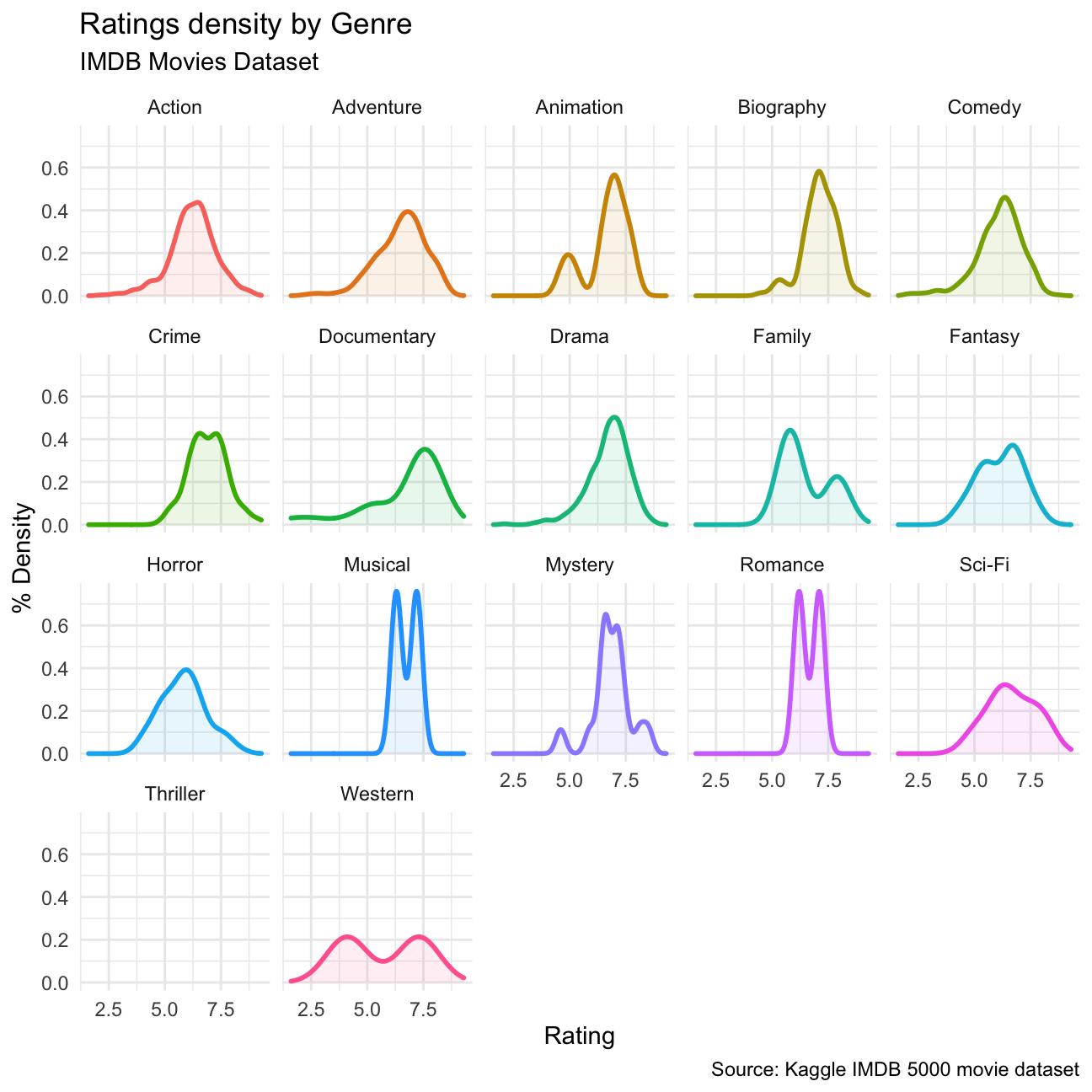
Use ggplot to answer the following
- Examine the relationship between
grossandcast_facebook_likes. Produce a scatterplot and write one sentence discussing whether the number of facebook likes that the cast has received is likely to be a good predictor of how much money a movie will make at the box office. What variable are you going to map to the Y- and X- axes?
movies %>%
  ggplot(aes(x=cast_facebook_likes, y=gross)) +
  geom_point() +
  geom_smooth(method = "lm") +
  scale_x_continuous(limits = c(0, 150000)) +
  theme_minimal() +
  labs(
    title="Relationship between Facebook Likes and Gross Profit",
    subtitle="IMDB Movies Dataset",
    caption = "Source: Kaggle IMDB 5000 movie dataset",
    x="Cast movie likes",
    y="Gross profit ($M)"
    ) + NULL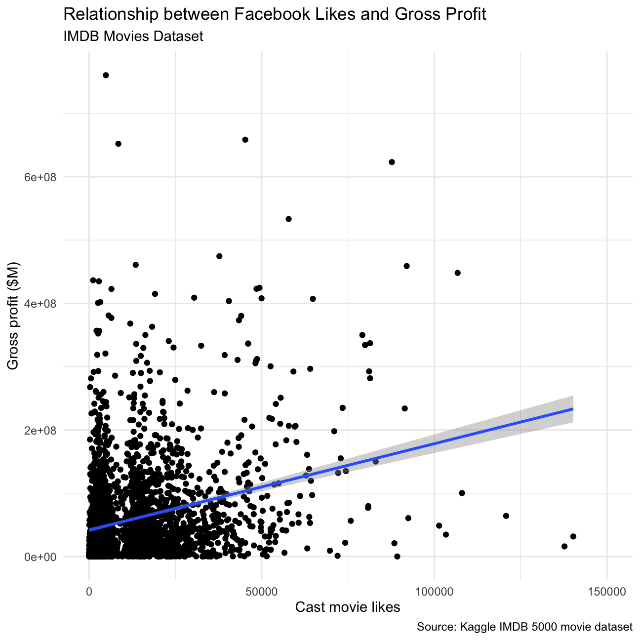
We chose to plot Cast Facebook likes on the X axes, Gross on the Y axes. The number of case facebook likes is not a good predictor as there does not seem to be a discernible correlation between the two, our argument is supported by a linear fit that shows a small positive correlation, but not enough to be significant. It is important to note that we have cut three outliers by limiting the x axis, as it did not help in visualizing the general tendency of the data.
- Examine the relationship between
grossandbudget. Produce a scatterplot and write one sentence discussing whether budget is likely to be a good predictor of how much money a movie will make at the box office.
ggplot(movies, aes(x= budget, y = gross))+
  geom_point()+geom_smooth(method=lm)+
  theme_minimal() +
  labs(
    title="Relationship between Budget and Gross Profit",
    subtitle="IMDB Movies Dataset",
    caption = "Source: Kaggle IMDB 5000 movie dataset",
    x="Movie budget ($M)",
    y="Gross profit ($M)"
    ) + NULL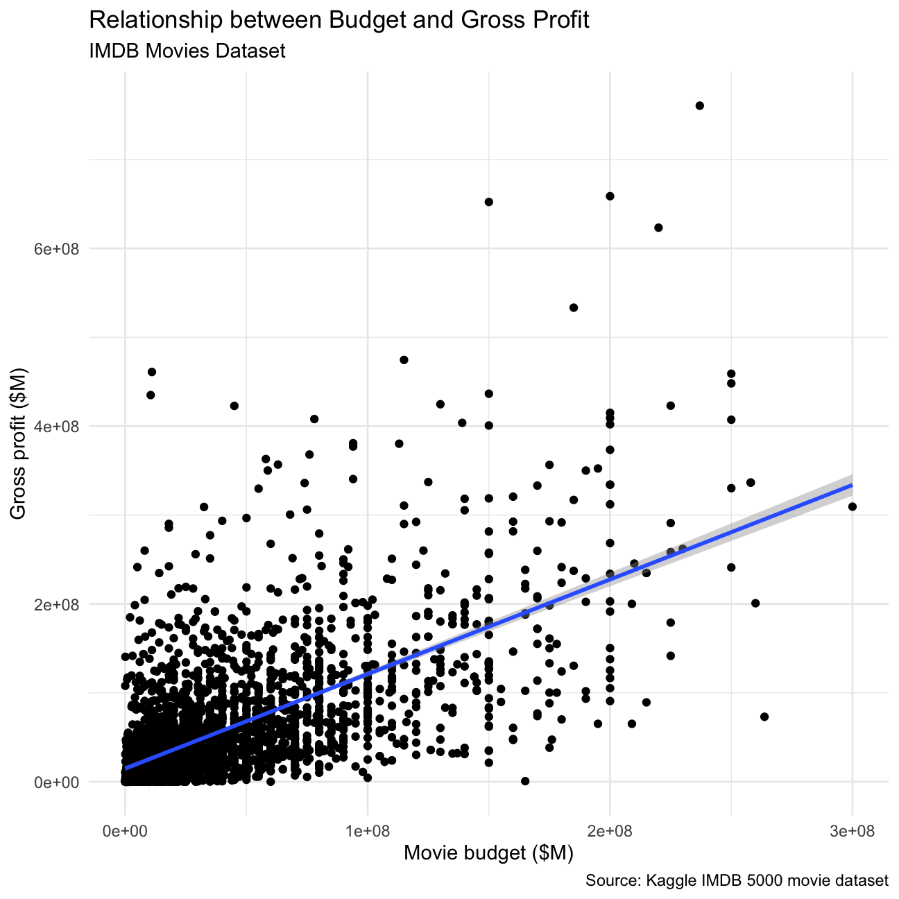
Budget is a good predictor of how much money a movie will make, as is shown by the positive correlation between the two.
- Examine the relationship between
grossandrating. Produce a scatterplot, faceted bygenreand discuss whether IMDB ratings are likely to be a good predictor of how much money a movie will make at the box office. Is there anything strange in this dataset?
ggplot(movies, aes(x= rating, y = gross))+
  facet_wrap(vars(genre))+
  geom_point()+geom_smooth(method=lm)+
  theme_minimal() +
  labs(
    title="Relationship between Rating and Gross Profit",
    subtitle="IMDB Movies Dataset",
    caption = "Source: Kaggle IMDB 5000 movie dataset",
    x="Movie Rating",
    y="Gross profit ($M)"
    ) + NULL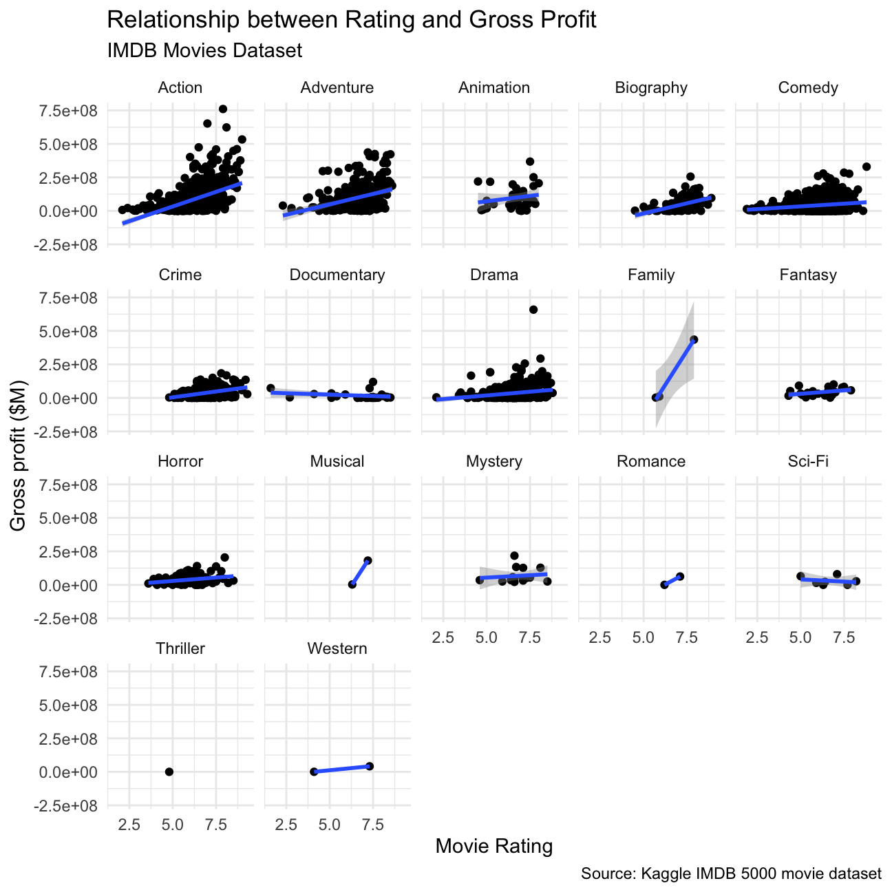
It is not a good predictor, as there is no significant relation between the movie rating and gross profit within most of the categories. The data set does not include enough data for genres such as sci-fi or family to determine a correlation between the gross and rating.
Returns of financial stocks
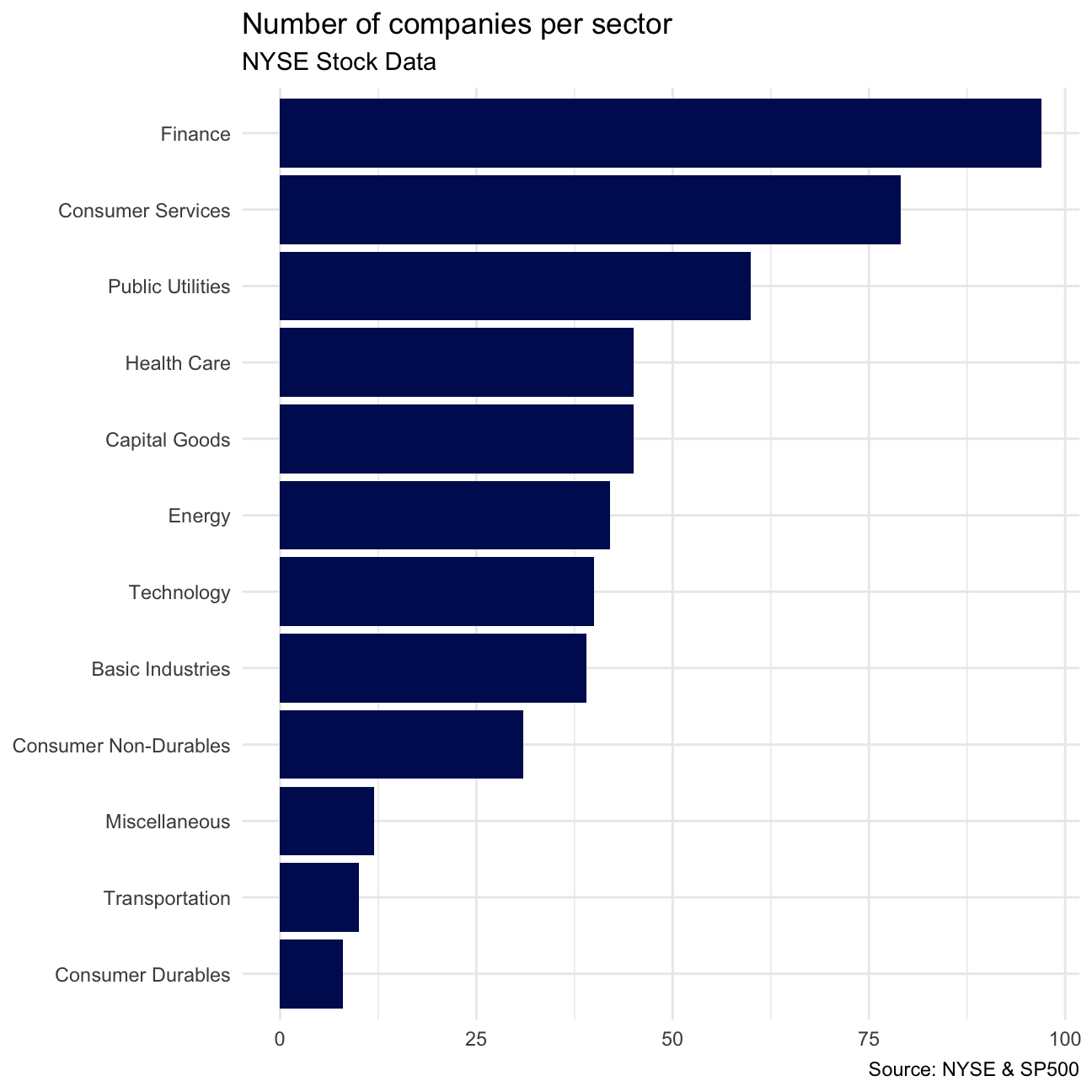
nyse <- read_csv(here::here("data","nyse.csv"))Based on this dataset, create a table and a bar plot that shows the number of companies per sector, in descending order
# TABLE OF COMPANIES PER SECTOR:
nyse %>%
  group_by(sector) %>%
  summarise(count = count(sector)) %>%
  arrange(desc(count)) -> companies_per_sector

# PRINT THE TABLE
companies_per_sector
## # A tibble: 12 × 2
## sector count
## <chr> <int>
## 1 Finance 97
## 2 Consumer Services 79
## 3 Public Utilities 60
## 4 Capital Goods 45
## 5 Health Care 45
## 6 Energy 42
## 7 Technology 40
## 8 Basic Industries 39
## 9 Consumer Non-Durables 31
## 10 Miscellaneous 12
## 11 Transportation 10
## 12 Consumer Durables 8# PLOT:
companies_per_sector %>%
mutate(sector = fct_reorder(sector, count)) %>%
ggplot(aes(x=sector, y=count)) +
geom_col(fill="#001461") +
theme_minimal() +
coord_flip() +
labs(
title="Number of companies per sector",
subtitle="NYSE Stock Data",
caption = "Source: NYSE & SP500",
x=NULL,
y=NULL
)
Next, let’s choose some stocks and their ticker symbols and download some data. You MUST choose 6 different stocks from the ones listed below; You should, however, add SPY which is the SP500 ETF (Exchange Traded Fund).
# Notice the cache=TRUE argument inthe chunk options. Because getting data is time consuming,
# cache=TRUE means that once it downloads data, the chunk will not run again next time you knit your Rmd

# We chose to delete DPZ
myStocks <- c("AAPL","JPM","DIS","ANF","TSLA","XOM","SPY" ) %>%
  tq_get(get  = "stock.prices",
         from = "2011-01-01",
         to   = "2022-08-31") %>%
  group_by(symbol)

glimpse(myStocks) # examine the structure of the resulting data frame
## Rows: 20,545
## Columns: 8
## Groups: symbol [7]
## $ symbol <chr> "AAPL", "AAPL", "AAPL", "AAPL", "AAPL", "AAPL", "AAPL", "AAPL…
## $ date <date> 2011-01-03, 2011-01-04, 2011-01-05, 2011-01-06, 2011-01-07, …
## $ open <dbl> 11.6, 11.9, 11.8, 12.0, 11.9, 12.1, 12.3, 12.3, 12.3, 12.4, 1…
## $ high <dbl> 11.8, 11.9, 11.9, 12.0, 12.0, 12.3, 12.3, 12.3, 12.4, 12.4, 1…
## $ low <dbl> 11.6, 11.7, 11.8, 11.9, 11.9, 12.0, 12.1, 12.2, 12.3, 12.3, 1…
## $ close <dbl> 11.8, 11.8, 11.9, 11.9, 12.0, 12.2, 12.2, 12.3, 12.3, 12.4, 1…
## $ volume <dbl> 4.45e+08, 3.09e+08, 2.56e+08, 3.00e+08, 3.12e+08, 4.49e+08, 4…
## $ adjusted <dbl> 10.05, 10.10, 10.18, 10.18, 10.25, 10.44, 10.42, 10.50, 10.54…Financial performance analysis depend on returns; If I buy a stock today for 100 and I sell it tomorrow for 101.75, my one-day return, assuming no transaction costs, is 1.75%. So given the adjusted closing prices, our first step is to calculate daily and monthly returns.
#calculate daily returns
myStocks_returns_daily <- myStocks %>%
  tq_transmute(select     = adjusted,
               mutate_fun = periodReturn,
               period     = "daily",
               type       = "log",
               col_rename = "daily_returns",
               cols = c(nested.col))

#calculate monthly  returns
myStocks_returns_monthly <- myStocks %>%
  tq_transmute(select     = adjusted,
               mutate_fun = periodReturn,
               period     = "monthly",
               type       = "arithmetic",
               col_rename = "monthly_returns",
               cols = c(nested.col))

#calculate yearly returns
myStocks_returns_annual <- myStocks %>%
  group_by(symbol) %>%
  tq_transmute(select     = adjusted,
               mutate_fun = periodReturn,
               period     = "yearly",
               type       = "arithmetic",
               col_rename = "yearly_returns",
               cols = c(nested.col))
Create a table where you summarise monthly returns for each of the stocks and SPY; min, max, median, mean, SD.
myStocks_returns_monthly %>%
  group_by(symbol) %>%
  summarise(min_return = min(monthly_returns),
            max_return = max(monthly_returns),
            med_return = median(monthly_returns),
            avg_return = mean(monthly_returns),
            sd_return  = sd(monthly_returns))
## # A tibble: 7 × 6
## symbol min_return max_return med_return avg_return sd_return
## <chr> <dbl> <dbl> <dbl> <dbl> <dbl>
## 1 AAPL -0.181 0.217 0.0230 0.0230 0.0791
## 2 ANF -0.421 0.507 0.00105 0.00337 0.146
## 3 DIS -0.186 0.234 0.00725 0.0113 0.0721
## 4 JPM -0.229 0.202 0.0199 0.0119 0.0727
## 5 SPY -0.125 0.127 0.0146 0.0106 0.0404
## 6 TSLA -0.224 0.811 0.0117 0.0501 0.177
## 7 XOM -0.262 0.241 0.00373 0.00756 0.0697Plot a density plot, using geom_density(), for each of the stocks
myStocks_returns_monthly %>%
  ggplot(aes(x = monthly_returns, color = symbol, fill = symbol)) +
  geom_density(size=2, alpha = .1) +
  theme_minimal() +
  labs(
    title="Returns by Symbol - Density Plot",
    subtitle="NYSE Stock Data",
    caption = "Source: NYSE & SP500",
    x="Monthly Return",
    y="% Density"
    )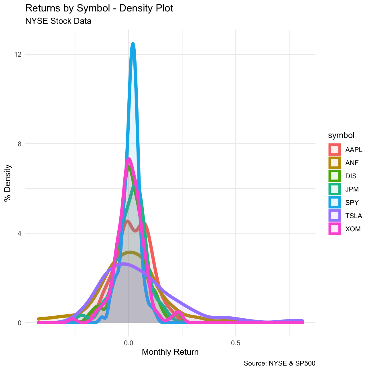
What can you infer from this plot? Which stock is the riskiest? The least risky?
TSLA stock seems to have its median in negative returns, it also is the most variable of the stocks, making it the riskiest of all. A close second is ANF, which has a similar density to TSLA, but with a slightly positive median.
The S&P500 index has clearly the least risky performance, so an investor could choose to invest in ETFs that mimic the S&P500. Another safe stock is JPM, which has a positive median return, and most of its density is positive as well. It also has very low variance.
Finally, make a plot that shows the expected monthly return (mean) of a stock on the Y axis and the risk (standard deviation) in the X-axis. Please use ggrepel::geom_text_repel() to label each stock
myStocks_returns_monthly %>%
  group_by(symbol) %>%
  summarise(mean_return = mean(monthly_returns), sd_return = sd(monthly_returns)) %>%
  ggplot(aes(x = mean_return, y = sd_return,  color = symbol, fill = symbol)) +
         geom_point(size=10, alpha=.5) +
         theme_minimal() +
  labs(
    title="Mean VS Standard Deviation Scatterplot",
    subtitle="NYSE Stock Data",
    caption = "Source: NYSE & SP500",
    x="Mean of Return",
    y="Standard Deviation of Return"
  )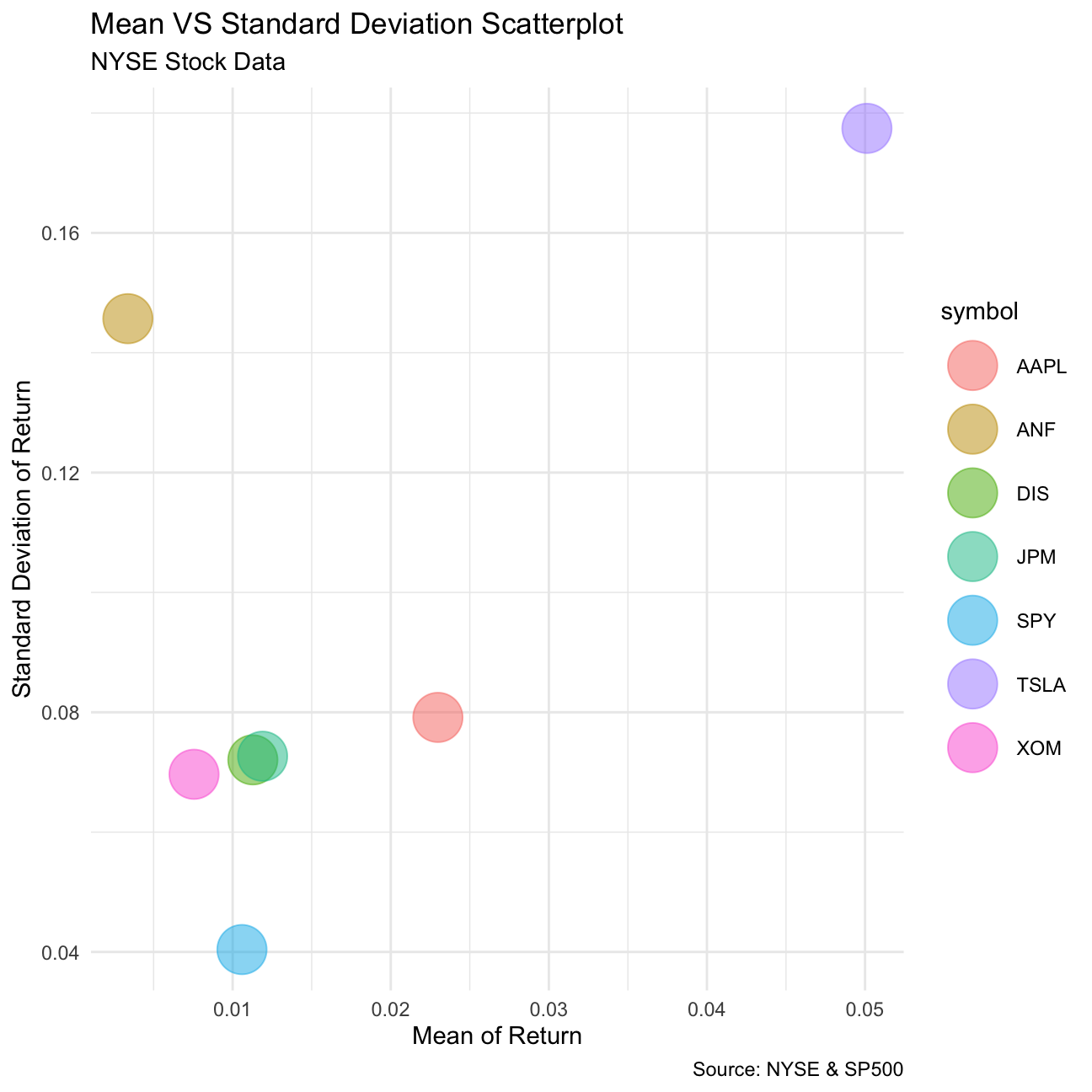
What can you infer from this plot? Are there any stocks which, while being riskier, do not have a higher expected return?
This plot confirms our previous findings from the density plot. TSLA is the most risky option with possibly highest returns. ANF is also a very risky stock, but with low returns, so investors should avoid this stock since others offer better mean returns with less risk. SPY however is the least risky investment with low expected return.
On your own: Spotify
Spotify have an API, an Application Programming Interface. APIs are ways for computer programs to talk to each other. So while we use Spotify app to look up songs and artists, computers use the Spotify API to talk to the spotify server. There is an R package that allows R to talk to this API: spotifyr. One of your team members, need to sign up and get a Spotify developer account and then you can download data about one’s Spotify usage. A detailed article on how to go about it can be found here Explore your activity on Spotify with R and spotifyr
If you do not want to use the API, you can download a sample of over 32K songs by having a look at https://github.com/rfordatascience/tidytuesday/blob/master/data/2020/2020-01-21/readme.md
spotify_songs <- readr::read_csv('https://raw.githubusercontent.com/rfordatascience/tidytuesday/master/data/2020/2020-01-21/spotify_songs.csv')The data dictionary can be found below
| variable | class | description |
|---|---|---|
| track_id | character | Song unique ID |
| track_name | character | Song Name |
| track_artist | character | Song Artist |
| track_popularity | double | Song Popularity (0-100) where higher is better |
| track_album_id | character | Album unique ID |
| track_album_name | character | Song album name |
| track_album_release_date | character | Date when album released |
| playlist_name | character | Name of playlist |
| playlist_id | character | Playlist ID |
| playlist_genre | character | Playlist genre |
| playlist_subgenre | character | Playlist subgenre |
| danceability | double | Danceability describes how suitable a track is for dancing based on a combination of musical elements including tempo, rhythm stability, beat strength, and overall regularity. A value of 0.0 is least danceable and 1.0 is most danceable. |
| energy | double | Energy is a measure from 0.0 to 1.0 and represents a perceptual measure of intensity and activity. Typically, energetic tracks feel fast, loud, and noisy. For example, death metal has high energy, while a Bach prelude scores low on the scale. Perceptual features contributing to this attribute include dynamic range, perceived loudness, timbre, onset rate, and general entropy. |
| key | double | The estimated overall key of the track. Integers map to pitches using standard Pitch Class notation . E.g. 0 = C, 1 = C♯/D♭, 2 = D, and so on. If no key was detected, the value is -1. |
| loudness | double | The overall loudness of a track in decibels (dB). Loudness values are averaged across the entire track and are useful for comparing relative loudness of tracks. Loudness is the quality of a sound that is the primary psychological correlate of physical strength (amplitude). Values typical range between -60 and 0 db. |
| mode | double | Mode indicates the modality (major or minor) of a track, the type of scale from which its melodic content is derived. Major is represented by 1 and minor is 0. |
| speechiness | double | Speechiness detects the presence of spoken words in a track. The more exclusively speech-like the recording (e.g. talk show, audio book, poetry), the closer to 1.0 the attribute value. Values above 0.66 describe tracks that are probably made entirely of spoken words. Values between 0.33 and 0.66 describe tracks that may contain both music and speech, either in sections or layered, including such cases as rap music. Values below 0.33 most likely represent music and other non-speech-like tracks. |
| acousticness | double | A confidence measure from 0.0 to 1.0 of whether the track is acoustic. 1.0 represents high confidence the track is acoustic. |
| instrumentalness | double | Predicts whether a track contains no vocals. “Ooh” and “aah” sounds are treated as instrumental in this context. Rap or spoken word tracks are clearly “vocal”. The closer the instrumentalness value is to 1.0, the greater likelihood the track contains no vocal content. Values above 0.5 are intended to represent instrumental tracks, but confidence is higher as the value approaches 1.0. |
| liveness | double | Detects the presence of an audience in the recording. Higher liveness values represent an increased probability that the track was performed live. A value above 0.8 provides strong likelihood that the track is live. |
| valence | double | A measure from 0.0 to 1.0 describing the musical positiveness conveyed by a track. Tracks with high valence sound more positive (e.g. happy, cheerful, euphoric), while tracks with low valence sound more negative (e.g. sad, depressed, angry). |
| tempo | double | The overall estimated tempo of a track in beats per minute (BPM). In musical terminology, tempo is the speed or pace of a given piece and derives directly from the average beat duration. |
| duration_ms | double | Duration of song in milliseconds |
In this dataset, there are only 6 types of playlist_genre , but we can still try to perform EDA on this dataset.
Produce a one-page summary describing this dataset. Here is a non-exhaustive list of questions:
What is the distribution of songs’ popularity (
track_popularity). Does it look like a Normal distribution?It looks not like a standard normal distribution with very high frequency when track_popularity is close to 0.
count_track_popularity <- spotify_songs %>%
  select(track_name, track_popularity) %>%
   group_by(track_popularity) %>%
   summarize(count=n())
# %>%
count_track_popularity
## # A tibble: 101 × 2
## track_popularity count
## <dbl> <int>
## 1 0 2703
## 2 1 575
## 3 2 387
## 4 3 321
## 5 4 240
## 6 5 240
## 7 6 192
## 8 7 189
## 9 8 201
## 10 9 195
## # … with 91 more rows ggplot(data=count_track_popularity, aes(x=track_popularity, y=count)) +
geom_col() +
labs(
title="Track Popularity",
x="Track Popularity",
y=NULL
)
The distribution of song popularity does not resemble a normal distribution. The graph appears to present two different maxima. It appears that a vast majority of songs have no popularity, but once songs gain some traction they tend to group around a “normal distribution” with mean ~55.
There are 12 audio features for each track, including confidence measures like
acousticness,liveness,speechinesandinstrumentalness, perceptual measures likeenergy,loudness,danceabilityandvalence(positiveness), and descriptors likeduration,tempo,key, andmode. How are they distributed? can you roughly guess which of these variables is closer to Normal just by looking at summary statistics?According to our visualization, the audio features are not normally distributed with features of liveness and speechines.
library(GGally)

spotify_songs %>%
  select(12:23) %>%
  GGally::ggpairs() +
  theme_minimal(base_size = 8)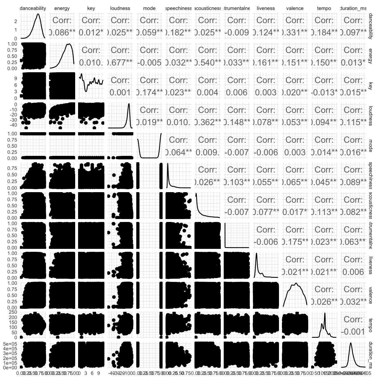
The distribution is visualised as above.Variables “danceability”, “energy”, “valence”,“duration_ms” are closer to normal distribution.
- Is there any relationship between
valenceandtrack_popularity?danceabilityandtrack_popularity?
# valence and track_popularity

ggplot(data=spotify_songs, aes(x=valence, y=track_popularity)) +
  geom_point(size=1, alpha=.4,color="#001461") +
  geom_smooth(method = "lm", color="red") +
  labs(
    title="Relation between Valence and Track Popularity",
    x = "Valence",
    y = "Track Popularity",
  ) +
  theme_minimal()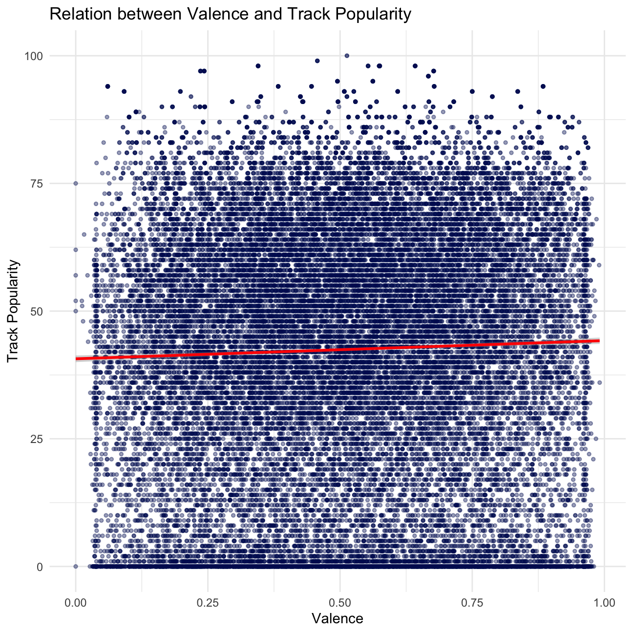
ggplot(data=spotify_songs, aes(x=danceability, y=track_popularity)) +
  geom_point(size=1, alpha=.4, color="#001461") +
  geom_smooth(method = "lm", color="red") +
  labs(
    title="Relation between Danceability and Track Popularity",
    x = "Danceability",
    y = "Track Popularity",
  ) +
  theme_minimal()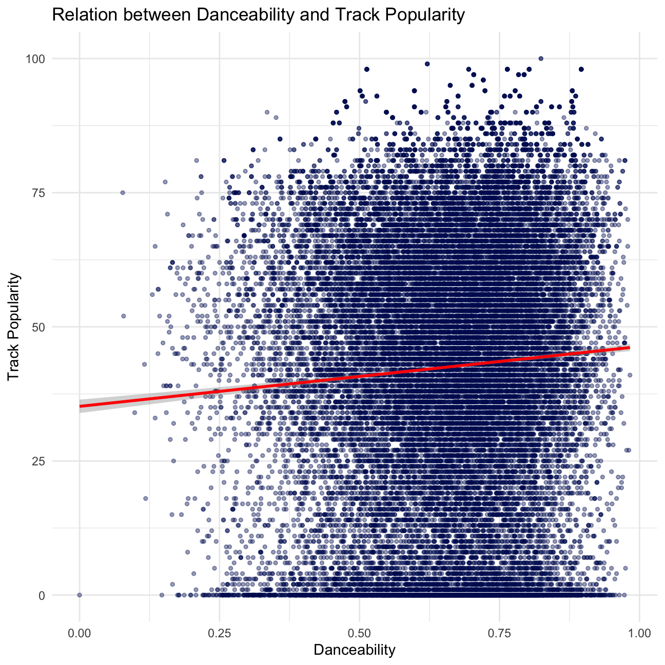
spotify_songs## # A tibble: 32,833 × 23
## track_id track…¹ track…² track…³ track…⁴ track…⁵ track…⁶ playl…⁷ playl…⁸
## <chr> <chr> <chr> <dbl> <chr> <chr> <chr> <chr> <chr>
## 1 6f807x0ima9a… I Don'… Ed She… 66 2oCs0D… I Don'… 2019-0… Pop Re… 37i9dQ…
## 2 0r7CVbZTWZgb… Memori… Maroon… 67 63rPSO… Memori… 2019-1… Pop Re… 37i9dQ…
## 3 1z1Hg7Vb0AhH… All th… Zara L… 70 1HoSmj… All th… 2019-0… Pop Re… 37i9dQ…
## 4 75FpbthrwQmz… Call Y… The Ch… 60 1nqYsO… Call Y… 2019-0… Pop Re… 37i9dQ…
## 5 1e8PAfcKUYoK… Someon… Lewis … 69 7m7vv9… Someon… 2019-0… Pop Re… 37i9dQ…
## 6 7fvUMiyapMsR… Beauti… Ed She… 67 2yiy9c… Beauti… 2019-0… Pop Re… 37i9dQ…
## 7 2OAylPUDDfwR… Never … Katy P… 62 7INHYS… Never … 2019-0… Pop Re… 37i9dQ…
## 8 6b1RNvAcJjQH… Post M… Sam Fe… 69 6703SR… Post M… 2019-0… Pop Re… 37i9dQ…
## 9 7bF6tCO3gFb8… Tough … Avicii 68 7CvAfG… Tough … 2019-0… Pop Re… 37i9dQ…
## 10 1IXGILkPm0tO… If I C… Shawn … 67 4Qxzbf… If I C… 2019-0… Pop Re… 37i9dQ…
## # … with 32,823 more rows, 14 more variables: playlist_genre <chr>,
## # playlist_subgenre <chr>, danceability <dbl>, energy <dbl>, key <dbl>,
## # loudness <dbl>, mode <dbl>, speechiness <dbl>, acousticness <dbl>,
## # instrumentalness <dbl>, liveness <dbl>, valence <dbl>, tempo <dbl>,
## # duration_ms <dbl>, and abbreviated variable names ¹track_name,
## # ²track_artist, ³track_popularity, ⁴track_album_id, ⁵track_album_name,
## # ⁶track_album_release_date, ⁷playlist_name, ⁸playlist_idThere seems to be no apparent relationship between valence and track_popularity, and no relationship between danceability and track_popularity based on our scatter plots. The line of best fit supports our findings.
modeindicates the modality (major or minor) of a track, the type of scale from which its melodic content is derived. Major is represented by 1 and minor is 0. Do songs written on a major scale have higherdanceabilitycompared to those in minor scale? What abouttrack_popularity?
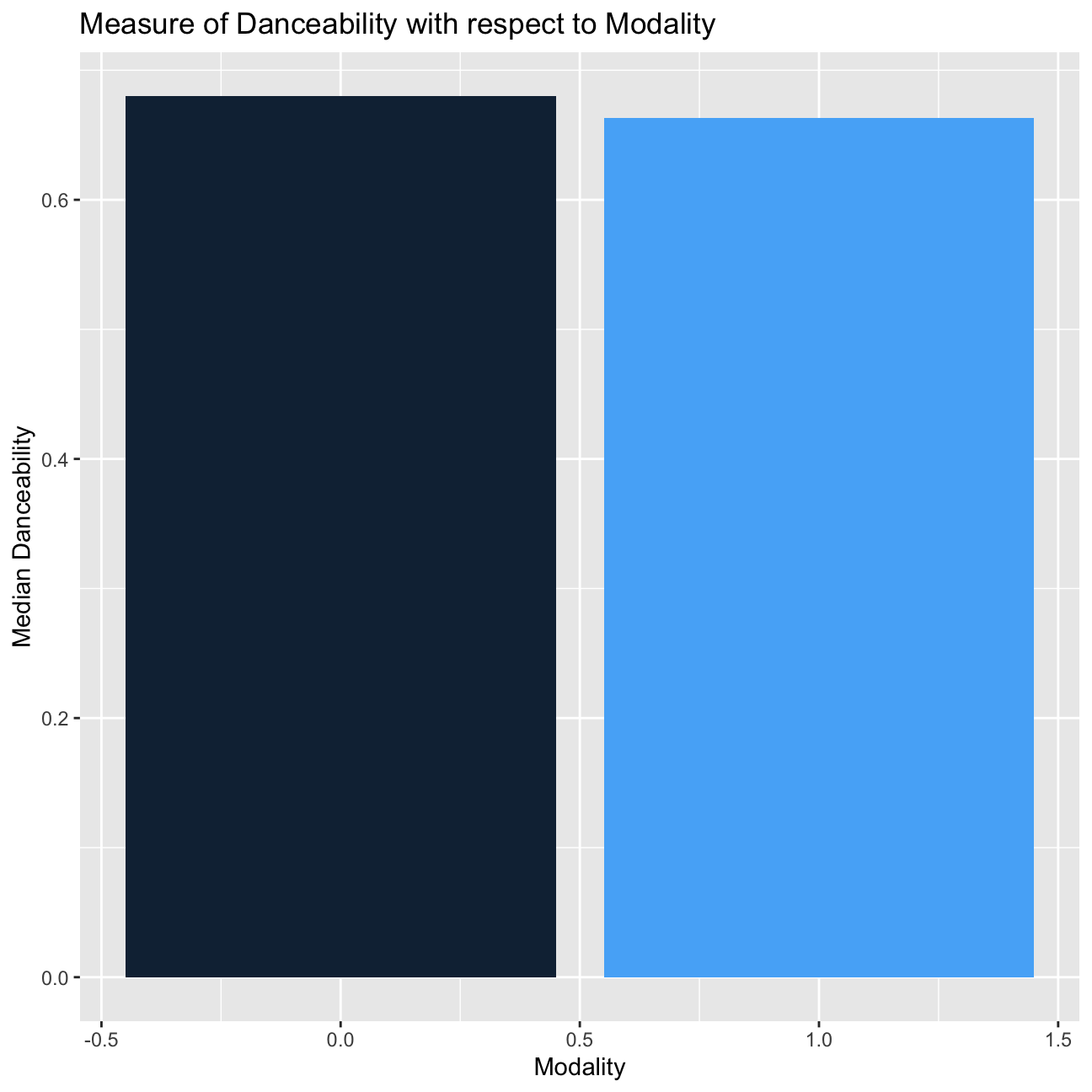
# danceability

spotify_songs %>%
  group_by(mode) %>%
  summarize(median_danceability = median(danceability)) %>%
   ggplot(aes(x=mode, y=median_danceability, fill=mode)) +
   geom_col() +
  theme(legend.position = "none") +
  labs(
    title="Measure of Danceability with respect to Modality",
    x = "Modality",
    y = "Median Danceability"
  )
# track_popularity

spotify_songs %>%
group_by(mode) %>%
summarize(median_track_popularity = median(track_popularity)) %>%
  ggplot(aes(x=mode, y=median_track_popularity, fill=mode)) +
  geom_col() +
  theme(legend.position = "none") +
  labs(
    title="Measure of Track Popularity with respect to Modality",
    x = "Modality",
    y = "Median Track Popularity"
  )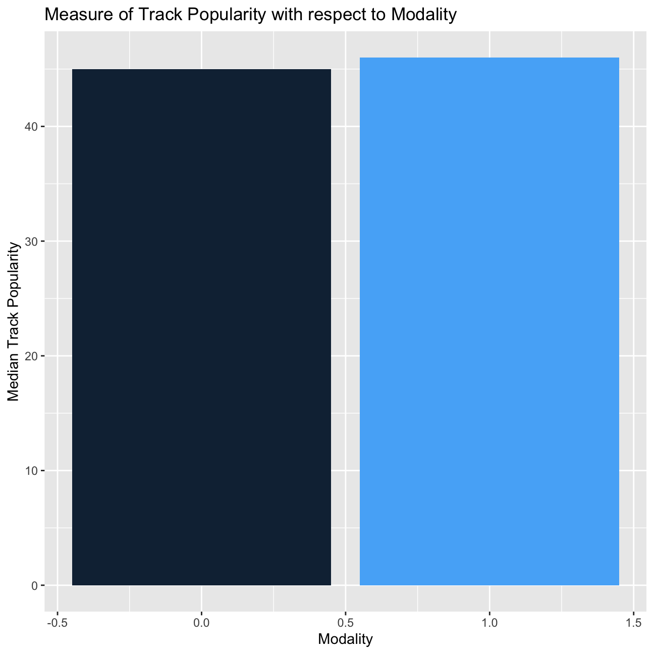
Songs written on a major scale have lower danceability compared to it in minor scale. However, songs written on a major scale have higher track_popularity compared to it in minor scale.
Challenge 1: Replicating a chart
The purpose of this exercise is to reproduce a plot using your dplyr and ggplot2 skills. It builds on exercise 1, the San Francisco rentals data.
You have to create a graph that calculates the cumulative % change for 0-, 1-1, and 2-bed flats between 2000 and 2018 for the top twelve cities in Bay Area, by number of ads that appeared in Craigslist.
list_of_top_12_cities=rent %>%
  count(city, sort=TRUE) %>%
  mutate(prop = n/sum(n)) %>%
  slice_max(prop, n=12) %>%
  mutate(city = fct_reorder(city, prop))

list_of_rent_for_top_12_cities=
  left_join(list_of_top_12_cities,rent,by="city")


by_city_year <- list_of_rent_for_top_12_cities %>%
  filter(beds<=2) %>%
  group_by(beds,city,year) %>%
  summarize(median_price=median(price))

pct_change <- by_city_year %>%
  # SUGESTED BY KOSTIS:
  # mutate(
  #   delta = median_price/ lag(median_price),
  #   delta = ifelse(is.na(delta),1,delta),
  #   cumulative_delta = cumprod(delta)
  # ) %>%

  # OUR ATTEMPT:
  mutate(lag.value = dplyr::lag(median_price, n = 1, default = NA)) %>%
  mutate(pct_change = case_when(is.na(lag.value) ~ 1, lag.value>0 ~ median_price/lag.value)) %>%
  mutate(cum_prod = cumprod(pct_change)) %>%
  mutate(cum_prod = cum_prod)

pct_change %>%
  ggplot(aes(x=year,y=cum_prod, color=city))+
  geom_line()+
  scale_y_continuous(labels = scales::percent_format(accuracy = 1)) +
   labs(title='Cumulative % change in 0, 1 and 2-bed rentals in Bay Area', subtitle='2000-2018', x="", y="") +
  theme(legend.position = "none", axis.text.x = element_text(angle = 90)) +
  facet_grid(vars(beds),vars(city))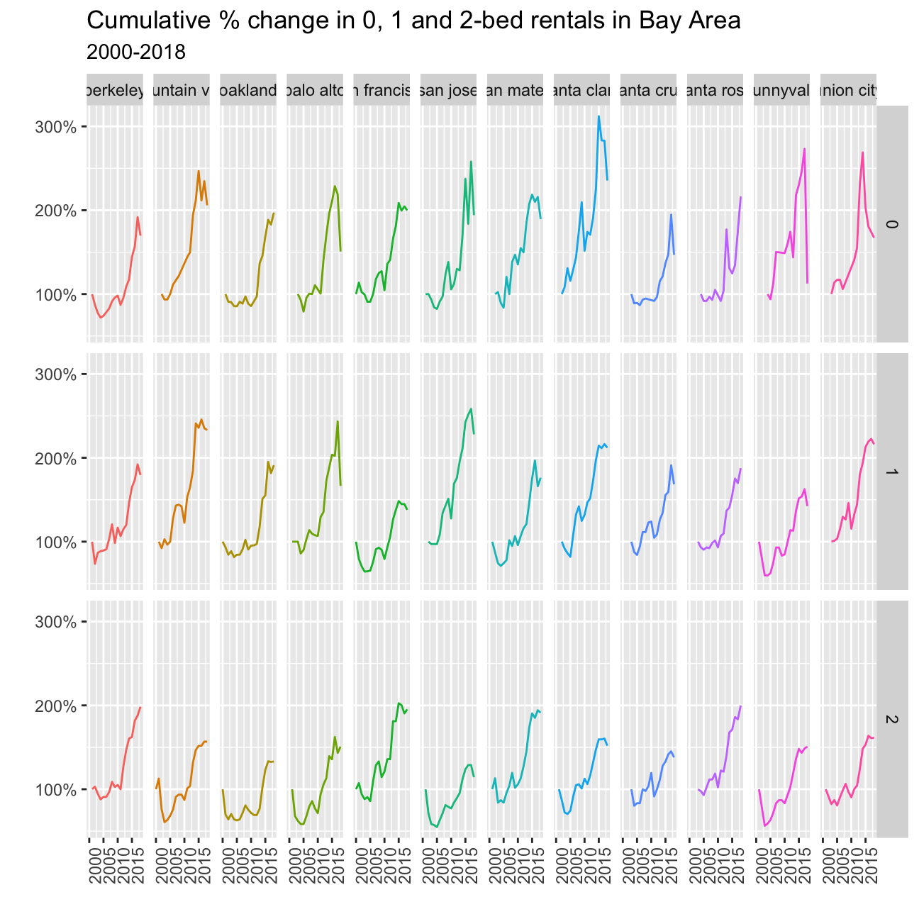
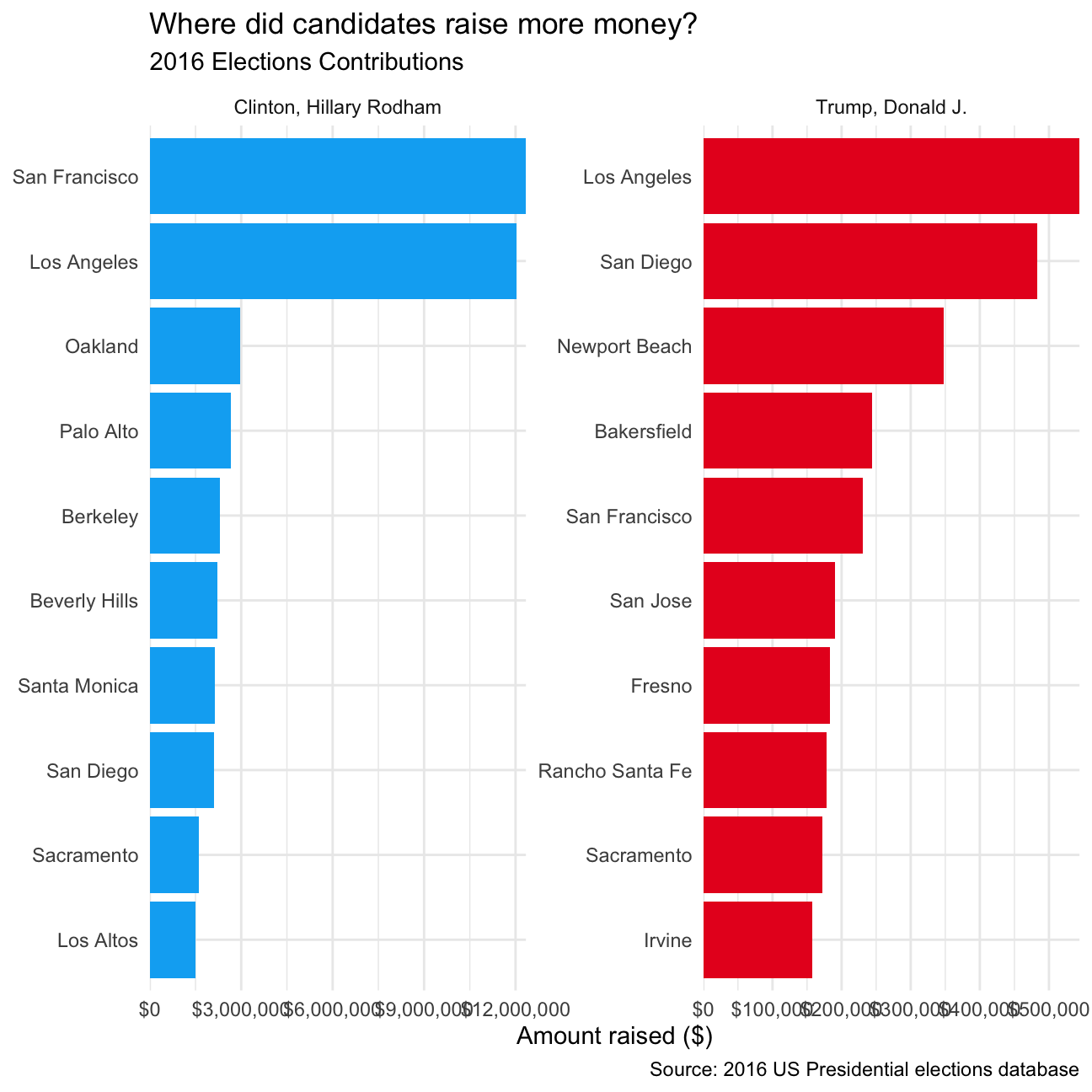
Challenge 2: 2016 California Contributors plots
As discussed in class, I would like you to reproduce the plot that shows the top ten cities in highest amounts raised in political contributions in California during the 2016 US Presidential election.

To get this plot, you must join two dataframes; the one you have with all contributions, and data that can translate zipcodes to cities. You can find a file with all US zipcodes, e.g., here http://www.uszipcodelist.com/download.html.
The easiest way would be to create two plots and then place one next to each other. For this, you will need the patchwork package. https://cran.r-project.org/web/packages/patchwork/index.html
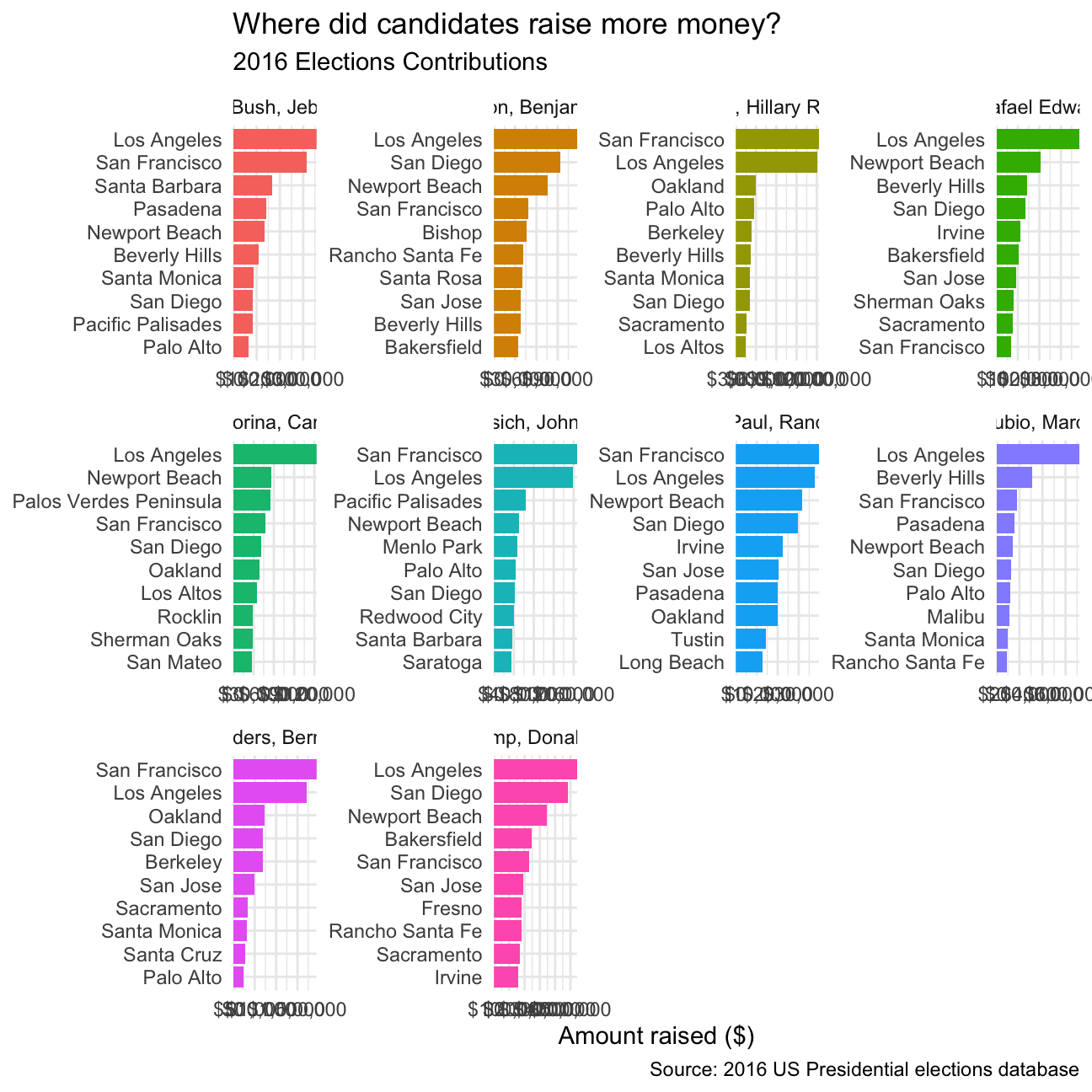
While this is ok, what if one asked you to create the same plot for the top 10 candidates and not just the top two? The most challenging part is how to reorder within categories, and for this you will find Julia Silge’s post on REORDERING AND FACETTING FOR GGPLOT2 useful.
# Make sure you use vroom() as it is significantly faster than read.csv()
CA_contributors_2016 <- vroom::vroom(here::here("data","CA_contributors_2016.csv"))

zip_codes_us <- vroom::vroom(here::here("data","zip_code_database.csv"))
CA_contributors_t_and_h <- # TRUMP AND HILLARY DATA
CA_contributors_2016 %>%
filter(cand_nm %in% c('Clinton, Hillary Rodham', 'Trump, Donald J.')) %>%
mutate(zip = as.character(zip)) %>% # MAKING SURE THEY HAVE THE SAME TYPE
left_join(zip_codes_us, by="zip")
library(tidytext)
CA_contributors_t_and_h %>%
group_by(cand_nm,primary_city) %>%
summarise(total_contrib = sum(contb_receipt_amt)) %>%
ungroup %>%
group_by(cand_nm) %>%
top_n(10) %>%
ungroup %>%
mutate(candidate = as.factor(cand_nm),
city = reorder_within(primary_city, total_contrib, candidate)) %>%
ggplot(aes(city, total_contrib, fill=candidate)) +
geom_col(show.legend = FALSE) +
facet_wrap(~candidate, scales = "free") +
coord_flip() +
scale_x_reordered() +
scale_y_continuous(expand = c(0,0), labels = scales::dollar) +
scale_fill_manual(values=c("#00AEF3", "#E81B23")) +
theme_minimal() +
labs(
title="Where did candidates raise more money?",
subtitle = "2016 Elections Contributions",
caption = "Source: 2016 US Presidential elections database",
y = "Amount raised ($)",
x = NULL
)
If we were to plot 10 top candidates, this is how we would approach the code:
# TOP 10 CANDIDATES SEARCH:
top_10_candidates <-
  CA_contributors_2016 %>%
    group_by(cand_nm) %>%
    summarise(total_contrib = sum(contb_receipt_amt)) %>%
    slice_max(total_contrib, n=10)

# FILTER BY TOP TEN CANDIDATES WITH JOIN:
CA_contributors_top10 <-
  left_join(top_10_candidates, CA_contributors_2016, by="cand_nm") %>%
  mutate(zip = as.character(zip)) %>% # MAKING SURE THEY HAVE THE SAME TYPE
  left_join(zip_codes_us, by="zip")

CA_contributors_top10 %>%
  group_by(cand_nm,primary_city) %>%
  summarise(total_contrib = sum(contb_receipt_amt)) %>%
  ungroup %>%
  group_by(cand_nm) %>%
  top_n(10) %>%
  ungroup %>%
  mutate(candidate = as.factor(cand_nm),
         city = reorder_within(primary_city, total_contrib, candidate)) %>%
  ggplot(aes(city, total_contrib, fill=candidate)) +
    geom_col(show.legend = FALSE) +
    facet_wrap(~candidate, scales = "free") +
    coord_flip() +
    scale_x_reordered() +
    scale_y_continuous(expand = c(0,0), labels = scales::dollar) +
    theme_minimal() +
    labs(
      title="Where did candidates raise more money?",
      subtitle = "2016 Elections Contributions",
      caption = "Source: 2016 US Presidential elections database",
      y = "Amount raised ($)",
      x = NULL
    )
Deliverables
There is a lot of explanatory text, comments, etc. You do not need these, so delete them and produce a stand-alone document that you could share with someone. Knit the edited and completed R Markdown file as an HTML document (use the “Knit” button at the top of the script editor window) and upload it to Canvas.
Details
- Who did you collaborate with: Ishaan Khetan, Kathlyn Lee, Emilia Moskala, Juan Sanchez-Blanco, Sylvie Zheng, Jingyi Fang
- Approximately how much time did you spend on this problem set: 10h
- What, if anything, gave you the most trouble: Both challenges gave us the most trouble
Please seek out help when you need it, and remember the 15-minute rule. You know enough R (and have enough examples of code from class and your readings) to be able to do this. If you get stuck, ask for help from others, post a question on Slack– and remember that I am here to help too!
As a true test to yourself, do you understand the code you submitted and are you able to explain it to someone else?
Yes
Rubric
Check minus (1/5): Displays minimal effort. Doesn’t complete all components. Code is poorly written and not documented. Uses the same type of plot for each graph, or doesn’t use plots appropriate for the variables being analyzed.
Check (3/5): Solid effort. Hits all the elements. No clear mistakes. Easy to follow (both the code and the output).
Check plus (5/5): Finished all components of the assignment correctly and addressed both challenges. Code is well-documented (both self-documented and with additional comments as necessary). Used tidyverse, instead of base R. Graphs and tables are properly labelled. Analysis is clear and easy to follow, either because graphs are labeled clearly or you’ve written additional text to describe how you interpret the output.