Youth Risk Behavior Surveillance
Every two years, the Centers for Disease Control and Prevention conduct the Youth Risk Behavior Surveillance System (YRBSS) survey, where it takes data from high schoolers (9th through 12th grade), to analyze health patterns. We are working with a random sample of observations for one of the years of the survey.
Load the data
We start by loading and glimpsing the data to get an idea of the variables we are working with.
data(yrbss)
glimpse(yrbss)
## Rows: 13,583
## Columns: 13
## $ age <int> 14, 14, 15, 15, 15, 15, 15, 14, 15, 15, 15, 1…
## $ gender <chr> "female", "female", "female", "female", "fema…
## $ grade <chr> "9", "9", "9", "9", "9", "9", "9", "9", "9", …
## $ hispanic <chr> "not", "not", "hispanic", "not", "not", "not"…
## $ race <chr> "Black or African American", "Black or Africa…
## $ height <dbl> NA, NA, 1.73, 1.60, 1.50, 1.57, 1.65, 1.88, 1…
## $ weight <dbl> NA, NA, 84.4, 55.8, 46.7, 67.1, 131.5, 71.2, …
## $ helmet_12m <chr> "never", "never", "never", "never", "did not …
## $ text_while_driving_30d <chr> "0", NA, "30", "0", "did not drive", "did not…
## $ physically_active_7d <int> 4, 2, 7, 0, 2, 1, 4, 4, 5, 0, 0, 0, 4, 7, 7, …
## $ hours_tv_per_school_day <chr> "5+", "5+", "5+", "2", "3", "5+", "5+", "5+",…
## $ strength_training_7d <int> 0, 0, 0, 0, 1, 0, 2, 0, 3, 0, 3, 0, 0, 7, 7, …
## $ school_night_hours_sleep <chr> "8", "6", "<5", "6", "9", "8", "9", "6", "<5"…skimr::skim(yrbss)| Name | yrbss |
| Number of rows | 13583 |
| Number of columns | 13 |
| _______________________ | |
| Column type frequency: | |
| character | 8 |
| numeric | 5 |
| ________________________ | |
| Group variables | None |
Variable type: character
| skim_variable | n_missing | complete_rate | min | max | empty | n_unique | whitespace |
|---|---|---|---|---|---|---|---|
| gender | 12 | 1.00 | 4 | 6 | 0 | 2 | 0 |
| grade | 79 | 0.99 | 1 | 5 | 0 | 5 | 0 |
| hispanic | 231 | 0.98 | 3 | 8 | 0 | 2 | 0 |
| race | 2805 | 0.79 | 5 | 41 | 0 | 5 | 0 |
| helmet_12m | 311 | 0.98 | 5 | 12 | 0 | 6 | 0 |
| text_while_driving_30d | 918 | 0.93 | 1 | 13 | 0 | 8 | 0 |
| hours_tv_per_school_day | 338 | 0.98 | 1 | 12 | 0 | 7 | 0 |
| school_night_hours_sleep | 1248 | 0.91 | 1 | 3 | 0 | 7 | 0 |
Variable type: numeric
| skim_variable | n_missing | complete_rate | mean | sd | p0 | p25 | p50 | p75 | p100 | hist |
|---|---|---|---|---|---|---|---|---|---|---|
| age | 77 | 0.99 | 16.16 | 1.26 | 12.00 | 15.0 | 16.00 | 17.00 | 18.00 | ▁▂▅▅▇ |
| height | 1004 | 0.93 | 1.69 | 0.10 | 1.27 | 1.6 | 1.68 | 1.78 | 2.11 | ▁▅▇▃▁ |
| weight | 1004 | 0.93 | 67.91 | 16.90 | 29.94 | 56.2 | 64.41 | 76.20 | 180.99 | ▆▇▂▁▁ |
| physically_active_7d | 273 | 0.98 | 3.90 | 2.56 | 0.00 | 2.0 | 4.00 | 7.00 | 7.00 | ▆▂▅▃▇ |
| strength_training_7d | 1176 | 0.91 | 2.95 | 2.58 | 0.00 | 0.0 | 3.00 | 5.00 | 7.00 | ▇▂▅▂▅ |
Exploratory Data Analysis
We will analyse the weight variable and see if exercise influences the weight of participants. To start off, we can see from the skim table that there’s 1004 missing values in the column. The distribution of the remaining values can be seen in the histogram below. The distribution is skewed right, with a mean of 67.91 kilograms.
ggplot(yrbss) +
  aes(x = weight) +
  geom_histogram() +
  theme_minimal()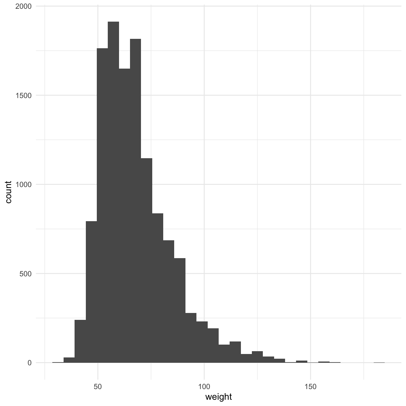
We consider the relationship between physical acitvity and weight. We will create a variable ‘physical_3plus’ that says whether a high schooler is physically active for at least 3 days a week. See below the number and % of students that are physically active. We have tested whether the count function and groupby-summarise give the same result for the count and the percentage, which is the case.
df_active <- yrbss %>%
  drop_na(physically_active_7d) %>%
  mutate(physical_3plus = ifelse(physically_active_7d > 2, 'yes','no') )

groupby_active <- df_active %>%
  group_by(physical_3plus) %>%
  summarise(nr_physical_3plus = n()) %>%
  mutate(perc_physical_3plus = nr_physical_3plus / sum(nr_physical_3plus))

groupby_active
## # A tibble: 2 × 3
## physical_3plus nr_physical_3plus perc_physical_3plus
## <chr> <int> <dbl>
## 1 no 4404 0.331
## 2 yes 8906 0.669count_active <- df_active %>%
count(physical_3plus) %>%
mutate(perc_physical_3plus = n / sum(n))
count_active## # A tibble: 2 × 3
## physical_3plus n perc_physical_3plus
## <chr> <int> <dbl>
## 1 no 4404 0.331
## 2 yes 8906 0.669We have calculated a 95% confidence interval for the proportion of high schoolers who are not active 3 or more days a week through bootstrapping with the infer package, which is 0.3 - 0.326. This means the majority of people are active 3+ days a week.
library(infer)

ci_proportion_activity <- df_active %>%
  mutate(physical_3plus = factor(physical_3plus)) %>%
  specify(response = physical_3plus, success = 'no') %>%
  generate(type = 'bootstrap', reps = 1000) %>%
  calculate(stat = 'prop') %>%
  get_confidence_interval(level = 0.95)

ci_proportion_activity
## # A tibble: 1 × 2
## lower_ci upper_ci
## <dbl> <dbl>
## 1 0.323 0.339To analyse the relationship between weight and physical activity, we are plotting 2 boxplots, 1 for those who are physically active 3+ days a week and those who are not. We would have expected physical activity to be inversely correlated with weight, as activity generally makes you lose weight. However, it appears in the boxplots that this is not the case. To explain that physically active people are heavier, we can think of two things. Firstly, muscle is heavier than fat, and people who exercise often have more muscle. Secondly, people who are heavier might want to exercise more often to lose weight.
ggplot(df_active) +
  aes(x = physical_3plus, y = weight) +
  geom_boxplot() +
  labs(
    title = 'Physical activity linked to higher average weight',
    y = 'Weight',
    x = 'Physically active 3+ days'
  ) +
coord_flip() 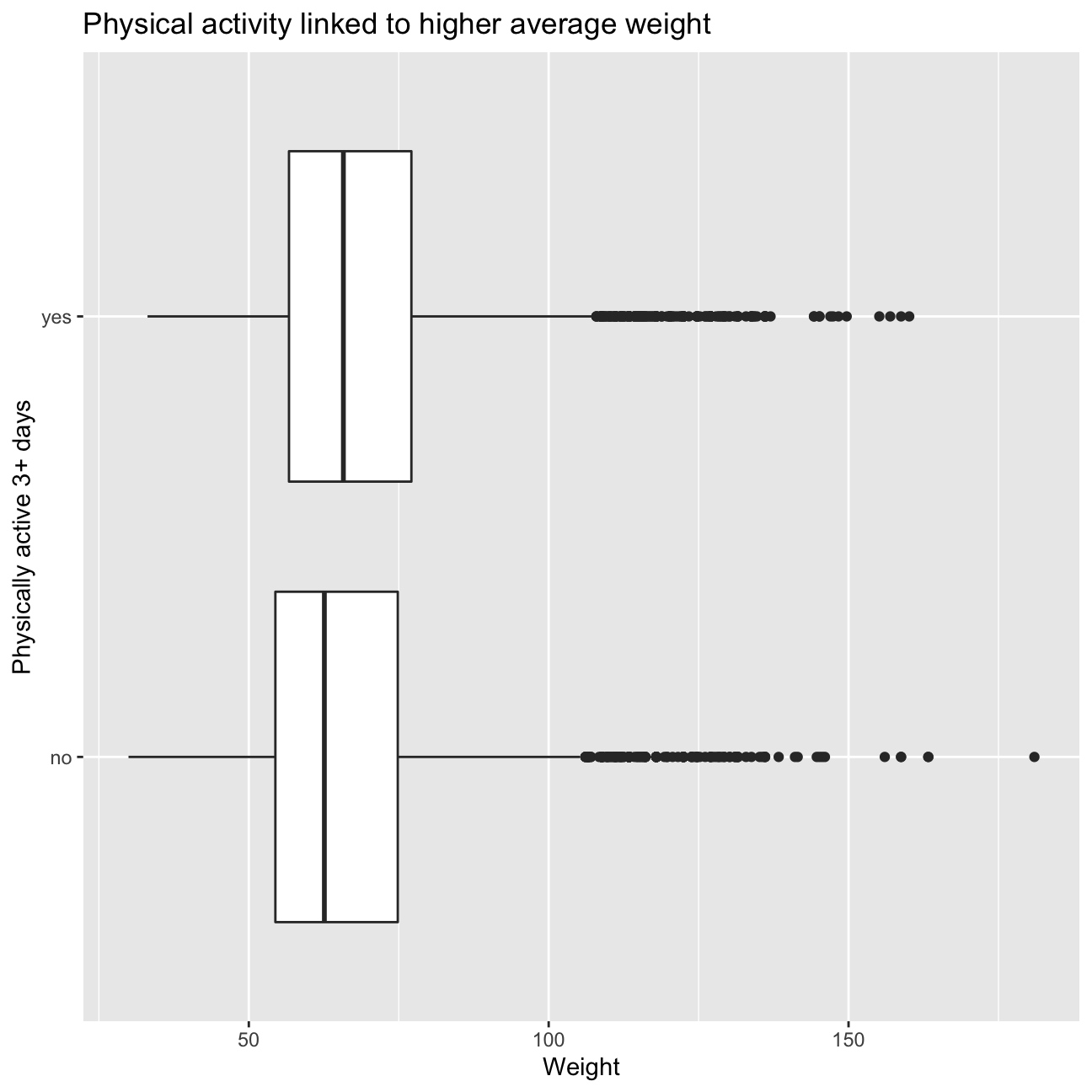
Confidence Interval
Boxplots show how the medians of the two distributions compare, but we also want to compare the means and see if there is a statistical difference. First we calculate the 95% confidence interval and then do a hypothesis test to confirm the difference.
means_active <- df_active %>%
  group_by(physical_3plus) %>%
  summarise(mean_weight = mean(weight, na.rm = TRUE),
            std_weight = sd(weight, na.rm = TRUE),
            count = n(),
            se = std_weight/sqrt(count),
            critical_t = qt(0.975, count-1),
            lower = mean_weight - critical_t * se,
            upper = mean_weight + critical_t * se)

means_active
## # A tibble: 2 × 8
## physical_3plus mean_weight std_weight count se critical_t lower upper
## <chr> <dbl> <dbl> <int> <dbl> <dbl> <dbl> <dbl>
## 1 no 66.7 17.6 4404 0.266 1.96 66.2 67.2
## 2 yes 68.4 16.5 8906 0.175 1.96 68.1 68.8There is an observed difference of about 1.77kg (68.44 - 66.67), and we notice that the two confidence intervals do not overlap. It seems that the difference is at least 95% statistically significant. Let us also conduct a hypothesis test.
Hypothesis test with formula
We are now going to test whether there’s a difference between the mean weights for those who are physically active at least 3x a week and those we don’t. Our null hypothesis is that there is no difference between the means. The alternative hypothesis is that there is a difference. We perform a t-test below to assess these hypotheses.
t.test( weight ~ physical_3plus, data = df_active)##
## Welch Two Sample t-test
##
## data: weight by physical_3plus
## t = -5, df = 7479, p-value = 9e-08
## alternative hypothesis: true difference in means between group no and group yes is not equal to 0
## 95 percent confidence interval:
## -2.42 -1.12
## sample estimates:
## mean in group no mean in group yes
## 66.7 68.4According to the t-test, there is a significant difference between the weight of people with 3+ days of phsyical activity and those without. Those who have 3+ days of physical activity have a higher weight.
POINT OF PROGRESS FOR STORYTIME
Hypothesis test with infer
Next, we will use the infer package to do a bootstrap simulation of the analysis. This will be used to calculate the difference in means.
obs_diff <- df_active %>%
  specify(weight ~ physical_3plus) %>%
  calculate(stat = "diff in means", order = c("yes", "no"))
null_dist <- df_active %>%
# specify variables
specify(weight ~ physical_3plus) %>%
# assume independence, i.e, there is no difference
hypothesize(null = "independence") %>%
# generate 1000 reps, of type "permute"
generate(reps = 1000, type = "permute") %>%
# calculate statistic of difference, namely "diff in means"
calculate(stat = "diff in means", order = c("yes", "no"))
null_dist## Response: weight (numeric)
## Explanatory: physical_3plus (factor)
## Null Hypothesis: independence
## # A tibble: 1,000 × 2
## replicate stat
## <int> <dbl>
## 1 1 0.0507
## 2 2 -0.286
## 3 3 -0.155
## 4 4 -0.242
## 5 5 0.0582
## 6 6 0.0122
## 7 7 -0.0598
## 8 8 0.516
## 9 9 -0.809
## 10 10 0.154
## # … with 990 more rowsvisualise(null_dist) 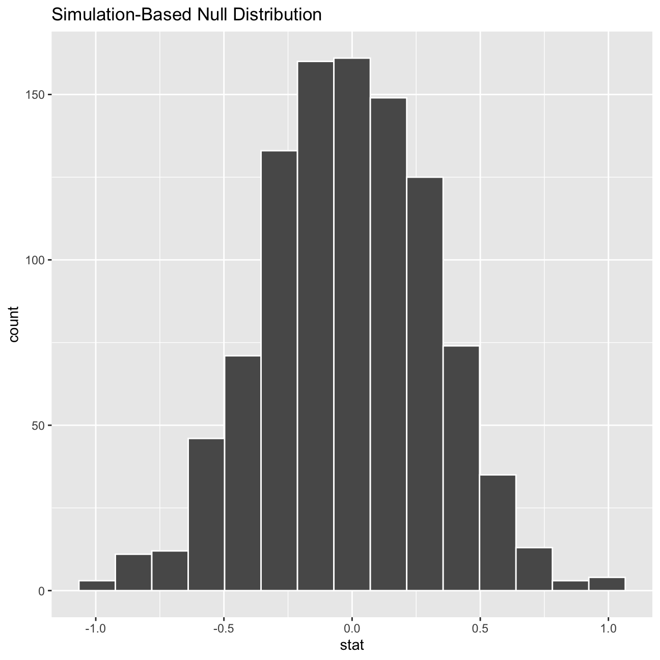
We have used hypothesize to set the null hypothesis as a test for independence, i.e. that there is no difference between the two mean Our null hypothesis (that there is no difference between the two means) has been set using the hypothesize function. The alternative hypothesis is that there is a difference in weight between those who exercise three or more days a week and those who don’t.
ggplot(data = null_dist, aes(x = stat)) +
  geom_histogram()
After this visualisation, we need to find the p-value associated with this statistical test to determine whether there is a statistically significant difference.
See below the visualisation of the p-value on top of the distribution. The p-value is also printed, which is 0 in this case. That means that there is a significant difference between the two means.
null_dist %>% visualize() +
  shade_p_value(obs_stat = obs_diff, direction = "two-sided")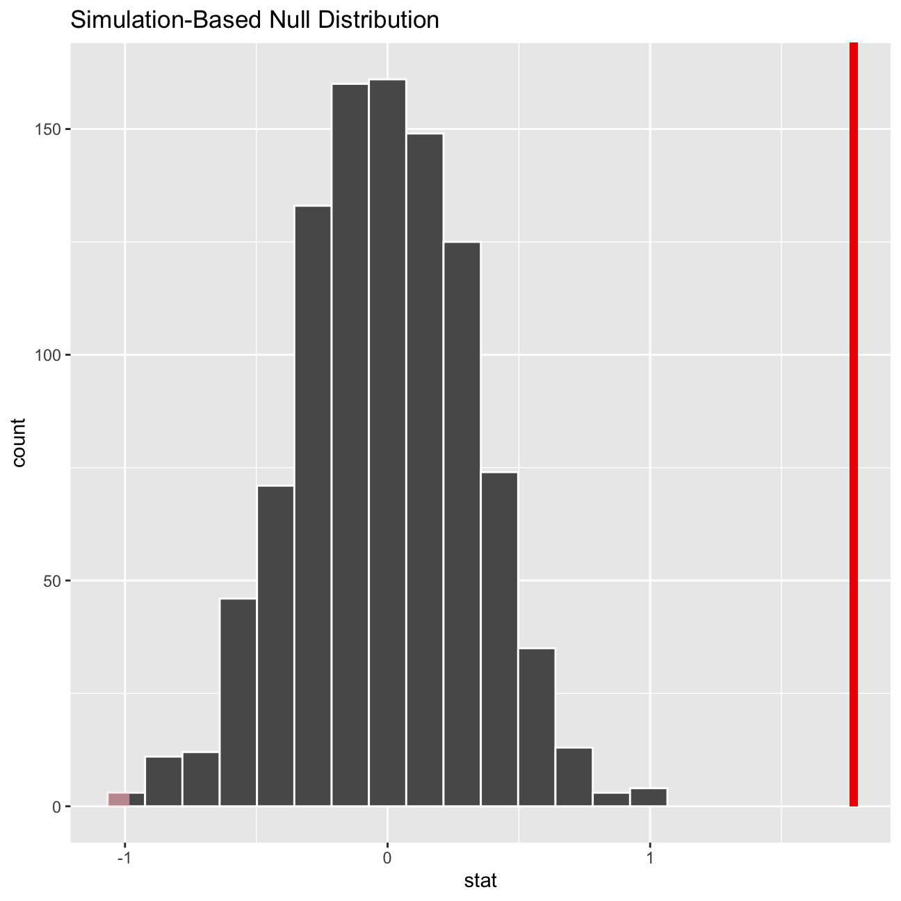
null_dist %>%
  get_p_value(obs_stat = obs_diff, direction = "two_sided")
## # A tibble: 1 × 1
## p_value
## <dbl>
## 1 0IMDB ratings: Differences between directors
We have a dataset containing a few thousand movies and their IMBD ratings. We want to explore whether movies directed by Steven Spielberg and Tim Burton are rated the same.
We have loaded the data and shown a glimpse of it below.
movies <- read_csv(here::here("data", "movies.csv"))
glimpse(movies)
## Rows: 2,961
## Columns: 11
## $ title <chr> "Avatar", "Titanic", "Jurassic World", "The Avenge…
## $ genre <chr> "Action", "Drama", "Action", "Action", "Action", "…
## $ director <chr> "James Cameron", "James Cameron", "Colin Trevorrow…
## $ year <dbl> 2009, 1997, 2015, 2012, 2008, 1999, 1977, 2015, 20…
## $ duration <dbl> 178, 194, 124, 173, 152, 136, 125, 141, 164, 93, 1…
## $ gross <dbl> 7.61e+08, 6.59e+08, 6.52e+08, 6.23e+08, 5.33e+08, …
## $ budget <dbl> 2.37e+08, 2.00e+08, 1.50e+08, 2.20e+08, 1.85e+08, …
## $ cast_facebook_likes <dbl> 4834, 45223, 8458, 87697, 57802, 37723, 13485, 920…
## $ votes <dbl> 886204, 793059, 418214, 995415, 1676169, 534658, 9…
## $ reviews <dbl> 3777, 2843, 1934, 2425, 5312, 3917, 1752, 1752, 35…
## $ rating <dbl> 7.9, 7.7, 7.0, 8.1, 9.0, 6.5, 8.7, 7.5, 8.5, 7.2, …To start assessing this, we create a dataframe with the 95% confidence interval for the mean of the rating for each of the directors, using the t-statistic. Then we plot the confidence intervals on the same graph to see if they overlap a lot.
chosen_directors <- c('Tim Burton','Steven Spielberg')

directors <- movies %>%
  filter(director %in% chosen_directors) %>%
  group_by(director) %>%
  summarise(mean_rating = mean(rating),
            sd_rating = sd(rating),
            count = n(),
            t_critical = qt(0.975, count-1),
            se_rating = sd_rating/sqrt(count),
            margin_of_error = t_critical * se_rating,
            lower = mean_rating - margin_of_error,
            upper = mean_rating + margin_of_error) %>%
  mutate(labels = round(mean_rating, 2))

directors
## # A tibble: 2 × 10
## director mean_…¹ sd_ra…² count t_cri…³ se_ra…⁴ margi…⁵ lower upper labels
## <chr> <dbl> <dbl> <int> <dbl> <dbl> <dbl> <dbl> <dbl> <dbl>
## 1 Steven Spiel… 7.57 0.695 23 2.07 0.145 0.301 7.27 7.87 7.57
## 2 Tim Burton 6.93 0.749 16 2.13 0.187 0.399 6.53 7.33 6.93
## # … with abbreviated variable names ¹mean_rating, ²sd_rating, ³t_critical,
## # ⁴se_rating, ⁵margin_of_errorggplot(data = directors) +
aes(y = director) +
geom_errorbarh(aes(xmin = lower, xmax = upper, color = director), size = 2, height = 0.1) +
geom_point(aes(x = mean_rating, color = director), size = 5) +
geom_rect(aes(xmin = 7.27, xmax = 7.33, ymin=0,ymax=3), fill = 'grey70', alpha=0.5) +
geom_text(aes(x = mean_rating, label = labels), vjust = 0, nudge_y = 0.05, overlap=FALSE) +
labs(
title = 'Do Tim Burton and Steven Spielberg have the same mean IMDB rating?',
subtitle = '95% confidence intervals overlap',
x = 'Rating',
y = NULL
) +
theme_minimal()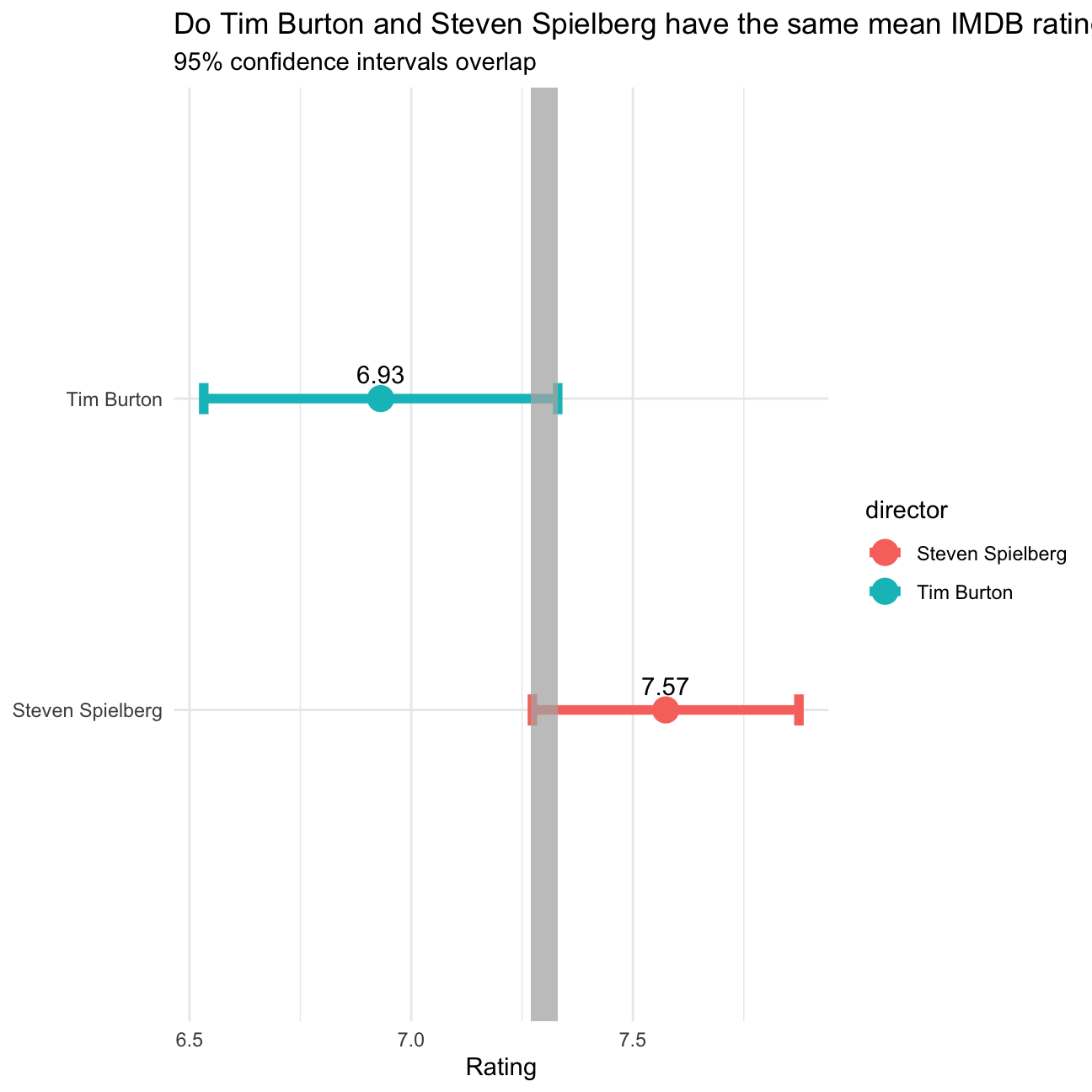
Seeing that the two intervals overalp in the grey highlighted area, we need to also conduct a statistical test to see if the means are statistically significantly different. For this, we run a t-test and use the infer package to bootstrap the data as well.
Our null hypothesis is that the means of the ratings of their films is the same. The alternative hypothesis is that there is a difference between the means of the ratings of Tim Burtons and Steven Spielbergs films. We will be using the t-statistic for the difference between the means. We are looking for a p-value smaller than 0.05 or a t-statistic bigger than 1.75 or smaller than -1.75 (based on df = 15 and p = 0.05). We have chosen the degrees of freedom as the smallest count - 1, which was 16 for Tim Burton.
df_directors <- movies  %>%
  filter(director %in% chosen_directors)

t.test(rating ~ director, data = df_directors)
##
## Welch Two Sample t-test
##
## data: rating by director
## t = 3, df = 31, p-value = 0.01
## alternative hypothesis: true difference in means between group Steven Spielberg and group Tim Burton is not equal to 0
## 95 percent confidence interval:
## 0.16 1.13
## sample estimates:
## mean in group Steven Spielberg mean in group Tim Burton
## 7.57 6.93directors_infer <- df_directors %>%
# specify variables
specify(rating ~ director) %>%
# assume independence, i.e, there is no difference
hypothesize(null = "independence") %>%
# generate 1000 reps, of type "permute"
generate(reps = 1000, type = "permute") %>%
# calculate statistic of difference, namely "diff in means"
calculate(stat = "diff in means", order = chosen_directors)
directors_infer %>%
get_p_value(obs_stat = obs_diff, direction = "two-sided")## # A tibble: 1 × 1
## p_value
## <dbl>
## 1 0According to both the t.test and the bootstrapped result, there is a signficant difference in the ratings of the movies of Tim Burton and Steven Spielberg. We see that Tim has a lower mean rating than Steven. The p-value for the t.test was 0.01 and the p-value for infer was 0.
Omega Group plc- Pay Discrimination
At the last board meeting of Omega Group Plc., the headquarters of a large multinational company, the issue was raised that women were being discriminated in the company, in the sense that the salaries were not the same for male and female executives.
We were asked to carry out the analysis to find out whether there is a significant difference between the salaries of men and women, and if there are any discrimination factors.
Loading the data
Omega Group Plc. had shared data of 50 employees with us. The data was inspected before conducting our analysis and we have noted that there were no missing/incomplete data points.
omega <- read_csv(here::here("data", "omega.csv"))
glimpse(omega) # examine the data frame
## Rows: 50
## Columns: 3
## $ salary <dbl> 81894, 69517, 68589, 74881, 65598, 76840, 78800, 70033, 635…
## $ gender <chr> "male", "male", "male", "male", "male", "male", "male", "ma…
## $ experience <dbl> 16, 25, 15, 33, 16, 19, 32, 34, 1, 44, 7, 14, 33, 19, 24, 3…Relationship Salary - Gender ?
The data frame omega contains the salaries for the sample of 50 executives in the company.
We have constructed a visualization that shows the salary trend between male and female employees:
#Extra Visual
ggplot(omega) +
  geom_boxplot() +
  aes(x = salary, y = gender, colour = gender) +
  labs (x = "Salary", y = "Gender", caption = "Source: Omega Plc salary data", title = "Male employees at Omega Plc have a higher salary than females", subtitle = "Boxplot showing the salary trend between males and females at Omega Plc")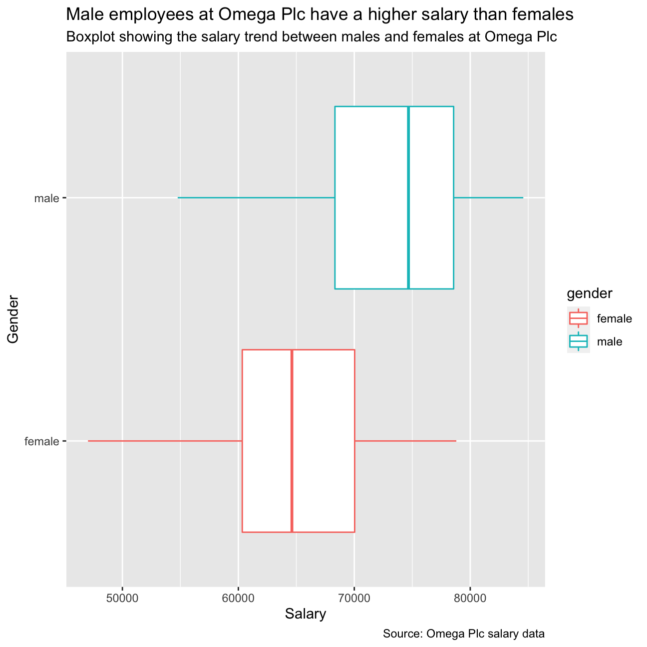
The above graph shows a visual difference between the average distributions of salary between female and male salary’s for Omega Plc. The group decided to extrapolate the data and construct tables depict these initial findings.
# Summary Statistics of salary by gender
mosaic::favstats (salary ~ gender, data=omega)
## gender min Q1 median Q3 max mean sd n missing
## 1 female 47033 60338 64618 70033 78800 64543 7567 26 0
## 2 male 54768 68331 74675 78568 84576 73239 7463 24 0#Summary Stats
summary_stats <- omega %>%
group_by(gender) %>%
summarise(mean_salary = mean(salary),
sd_salary = sd(salary),
count = n(),
t_critical = qt(0.975, count-1),
se_salary = sd(salary)/sqrt(count),
margin_of_error = t_critical * se_salary,
salary_low = mean_salary - margin_of_error,
salary_high = mean_salary + margin_of_error)
summary_stats## # A tibble: 2 × 9
## gender mean_salary sd_salary count t_critical se_sal…¹ margi…² salar…³ salar…⁴
## <chr> <dbl> <dbl> <int> <dbl> <dbl> <dbl> <dbl> <dbl>
## 1 female 64543. 7567. 26 2.06 1484. 3056. 61486. 67599.
## 2 male 73239. 7463. 24 2.07 1523. 3151. 70088. 76390.
## # … with abbreviated variable names ¹se_salary, ²margin_of_error, ³salary_low,
## # ⁴salary_highobs_diff <- omega %>%
specify(salary ~ gender) %>%
calculate(stat = "diff in means", order = c("male", "female"))
# Dataframe with two rows (male-female) and having as columns gender, mean, SD, sample size,
# the t-critical value, the standard error, the margin of error,
# and the low/high endpoints of a 95% condifence interval
p_val <- summary_stats %>%
get_p_value(obs_stat = obs_diff, direction = "two_sided")
p_val## # A tibble: 1 × 1
## p_value
## <dbl>
## 1 0From the initial analysis in the table above, it is shown that males have a higher mean salary of 8696 than females. We decided that more analysis is required to determine if this difference is significant and to decide if there are any further analysis required to uncover influencing factors.
Advanced Analysis
The team decided to conduct 2 tests to decide if the difference in mean salary’s between males and females were significant. The following tests were decided upon:
- Hypothesis Tesing useing the T Test package
- T Test using simulation method and infer packages
Hypothesis Tesing using the T Test package
The T Test package was used to assess if there is a true difference in the salaries, and findings form this built-in test shows that there is indeed a significant difference as indicated by the absolute T-Value being greater than 1.96, and the P-Value being smaller than 5%.
# hypothesis testing using t.test()
t.test(salary ~ gender, data = omega)
##
## Welch Two Sample t-test
##
## data: salary by gender
## t = -4, df = 48, p-value = 2e-04
## alternative hypothesis: true difference in means between group female and group male is not equal to 0
## 95 percent confidence interval:
## -12973 -4420
## sample estimates:
## mean in group female mean in group male
## 64543 73239We also ran a hypothesis test, assuming that the mean difference in salaries is zero as the null hypothesis using the simulation method from the infer package.
# hypothesis testing using infer package
library(infer)
set.seed(1234)
infer_stats <- omega %>%
  specify(salary ~ gender) %>%
  hypothesize(null = "independence",) %>%
  generate(reps = 1000, type ="permute") %>%
  calculate(stat = "diff in means", order = c("male", "female"))

percentile_ci <- infer_stats %>% get_confidence_interval(level = 0.95, type = "percentile")

visualize(infer_stats) + shade_p_value(obs_stat = obs_diff, direction = "two-sided")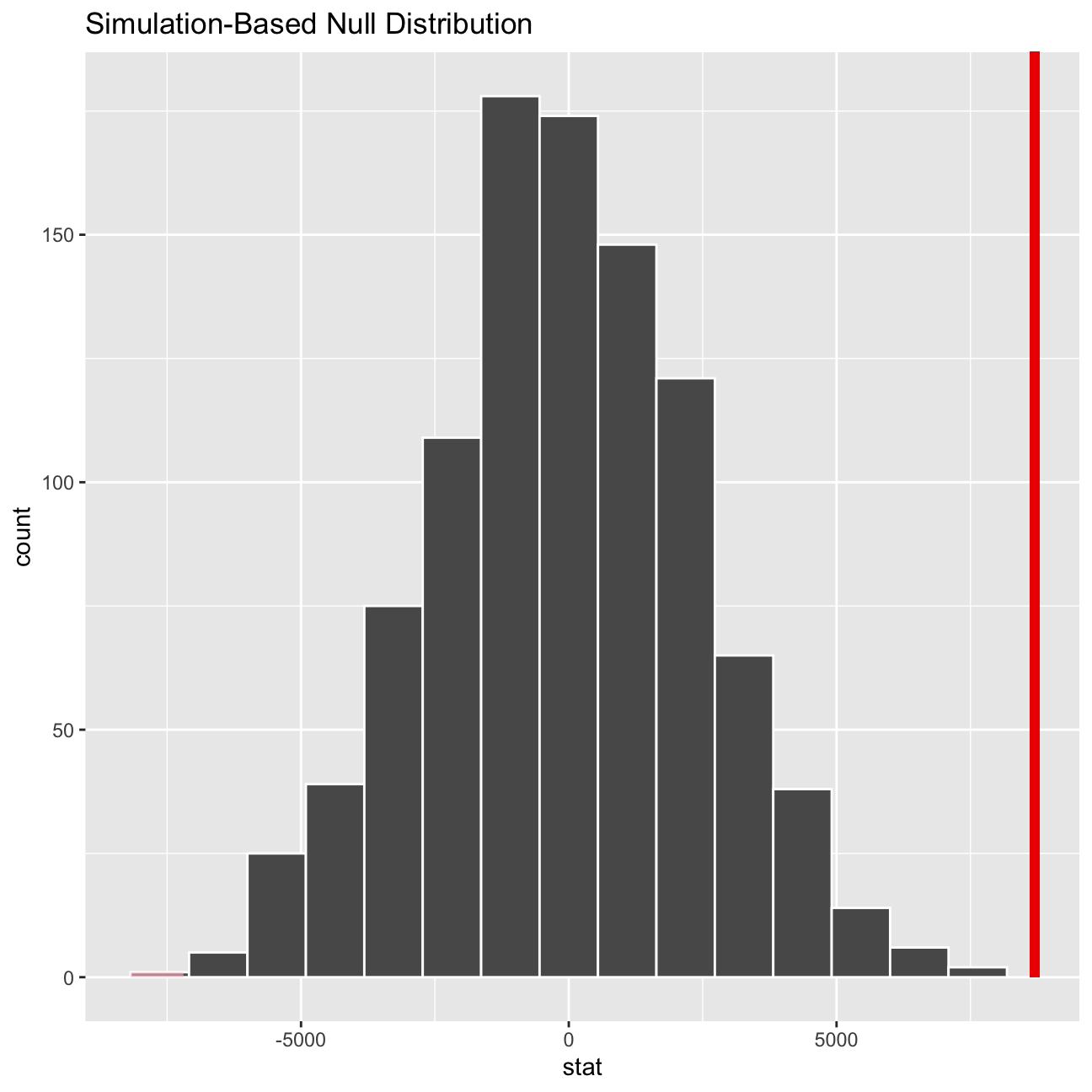
percentile_ci## # A tibble: 1 × 2
## lower_ci upper_ci
## <dbl> <dbl>
## 1 -5025. 4829.From both tests conducted, we can conclude that the observed difference in the means of salaries between males and females at Omega Plc is indeed a significant difference.
As depicted in the simulation density visualisation above, we can see that the observed difference is passed the Upper 95% percentile of 4829. This is confirmed by the t.test() performed that states the absolute T-value as 4, which is much bigger than the standard acceptable value of 1.96. Additionally, the p-value was smaller than 1%.
Relationship Experience - Gender?
At the board meeting, someone raised the issue that there was indeed a substantial difference between male and female salaries, but that this was attributable to other reasons such as differences in experience. A questionnaire send out to the 50 executives in the sample reveals that the average experience of the men is approximately 21 years, whereas the women only have about 7 years experience on average (see table below).
# Summary Statistics of experience by gender
favstats (experience ~ gender, data=omega)
## gender min Q1 median Q3 max mean sd n missing
## 1 female 0 0.25 3.0 14.0 29 7.38 8.51 26 0
## 2 male 1 15.75 19.5 31.2 44 21.12 10.92 24 0#Summary Stats
summary_stats_exp <- omega %>%
group_by(gender) %>%
summarise(mean_experience = mean(experience),
sd_experience = sd(experience),
count = n(),
t_critical = qt(0.975, count-1),
se_experience = sd(experience)/sqrt(count),
margin_of_error = t_critical * se_experience,
experience_low = mean_experience - margin_of_error,
experience_high = mean_experience + margin_of_error)
summary_stats_exp## # A tibble: 2 × 9
## gender mean_experience sd_expe…¹ count t_cri…² se_ex…³ margi…⁴ exper…⁵ exper…⁶
## <chr> <dbl> <dbl> <int> <dbl> <dbl> <dbl> <dbl> <dbl>
## 1 female 7.38 8.51 26 2.06 1.67 3.44 3.95 10.8
## 2 male 21.1 10.9 24 2.07 2.23 4.61 16.5 25.7
## # … with abbreviated variable names ¹sd_experience, ²t_critical,
## # ³se_experience, ⁴margin_of_error, ⁵experience_low, ⁶experience_highThe above data shows a difference in experience mean of 13.74 years between females and males. To establish if the observation is a significant difference, further analysis is required.
t.test(experience ~ gender, data = omega)##
## Welch Two Sample t-test
##
## data: experience by gender
## t = -5, df = 43, p-value = 1e-05
## alternative hypothesis: true difference in means between group female and group male is not equal to 0
## 95 percent confidence interval:
## -19.35 -8.13
## sample estimates:
## mean in group female mean in group male
## 7.38 21.12Further analysis was conducted in the form of a T Test to assess the if there is any significant differences in experience between genders. The following test show the statistical variables for Omega Plc.The findings show that there is a significant difference in the experience between males and females from Omega Plc, shown by the observed t-value is greater than 1.96 and a small p-value. This finding assists in validating the pervious observation - as the average experience of males suggests reason as to why the salaries of genders are different.
Based on this evidence, can you conclude that there is a significant difference between the experience of the male and female executives? Perform similar analyses as in the previous section. Does your conclusion validate or endanger your conclusion about the difference in male and female salaries?
Relationship Salary - Experience ?
To further substantiate the findings from the previous tests conducted, a final visual check is performed to determine if there have been any discrimination against females at Omega Plc.
ggplot(omega)+
  aes(x = experience, y = salary, color = gender)+
  geom_point() +
  geom_smooth(method = "lm") +
  labs(x = "Experience", y = "Salary", title = "Female's yearly increases are greater than that of men", subtitle = "Scatterplot showing the distribution of salary versus experience for males and females.")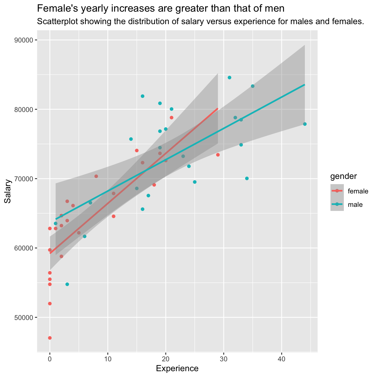
The plot shows that there are a greater proportion of female employees at Omega Plc with less than 10 years of experience as compared to males, while there is a greater proportion of males with more than 10 years of experience than females at the company
Correlation checks between gender, experience, and salary
The following graph shows a visual matrix of how gender and experience affect salary.
omega %>%
  select(gender, experience, salary) %>% #order variables they will appear in ggpairs()
  ggpairs(aes(colour=gender, alpha = 0.3))+
  theme_bw()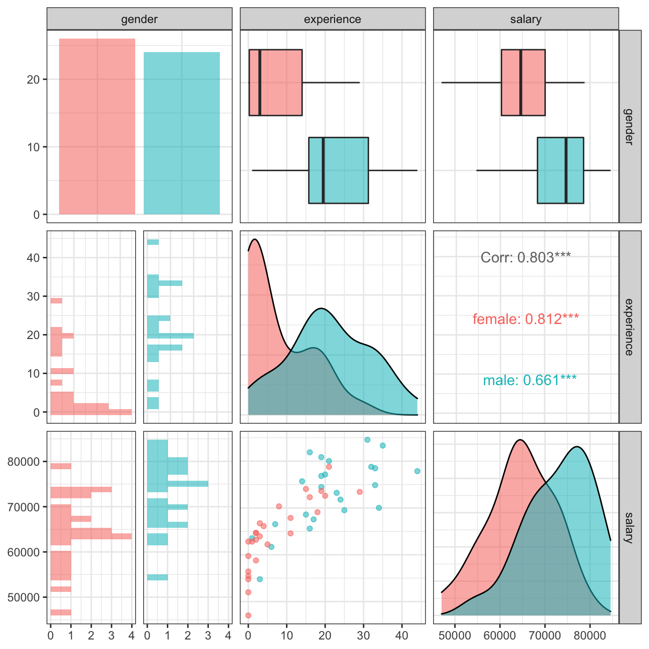
The visual assessing salary and experience for various genders shows the same finding as described in the visual before.
Challenge 1: Brexit plot
Recreating the Brexit Plot.
knitr::include_graphics(here::here("images", "brexit.png"), error = FALSE)
# read data directly off github repo
brexit_results <- read_csv("https://raw.githubusercontent.com/kostis-christodoulou/am01/master/data/brexit_results.csv")

filtered_brexit_data <- brexit_results %>%
  select(leave_share, con_2015, lab_2015, ld_2015, ukip_2015) %>%
  pivot_longer(cols = 2:5, names_to = "party", values_to = "percentage") # pivoting the data before preparing the plot

#filtered_brexit_data

ggplot(filtered_brexit_data) +
  aes(x = percentage, y = leave_share, colour = party) +
  geom_point(alpha = 0.35) +
  geom_smooth(method = "lm") +
  scale_color_manual(breaks = c("con_2015", "lab_2015", "ld_2015", "ukip_2015"), values=c("#0087DC", "#E4003B", "#FAA61A", "#FFD700"), labels=c('Conservative', 'Labour', 'Lib Dems', 'UKIP')) +
  labs(x = "Party % in the UK 2015 general election", y = "Party % in the 2016 Brexit referendum", title = "How political affiliation translated to Brexit Voting") +
 theme_bw() +
  theme(legend.position = "bottom", legend.title = element_blank())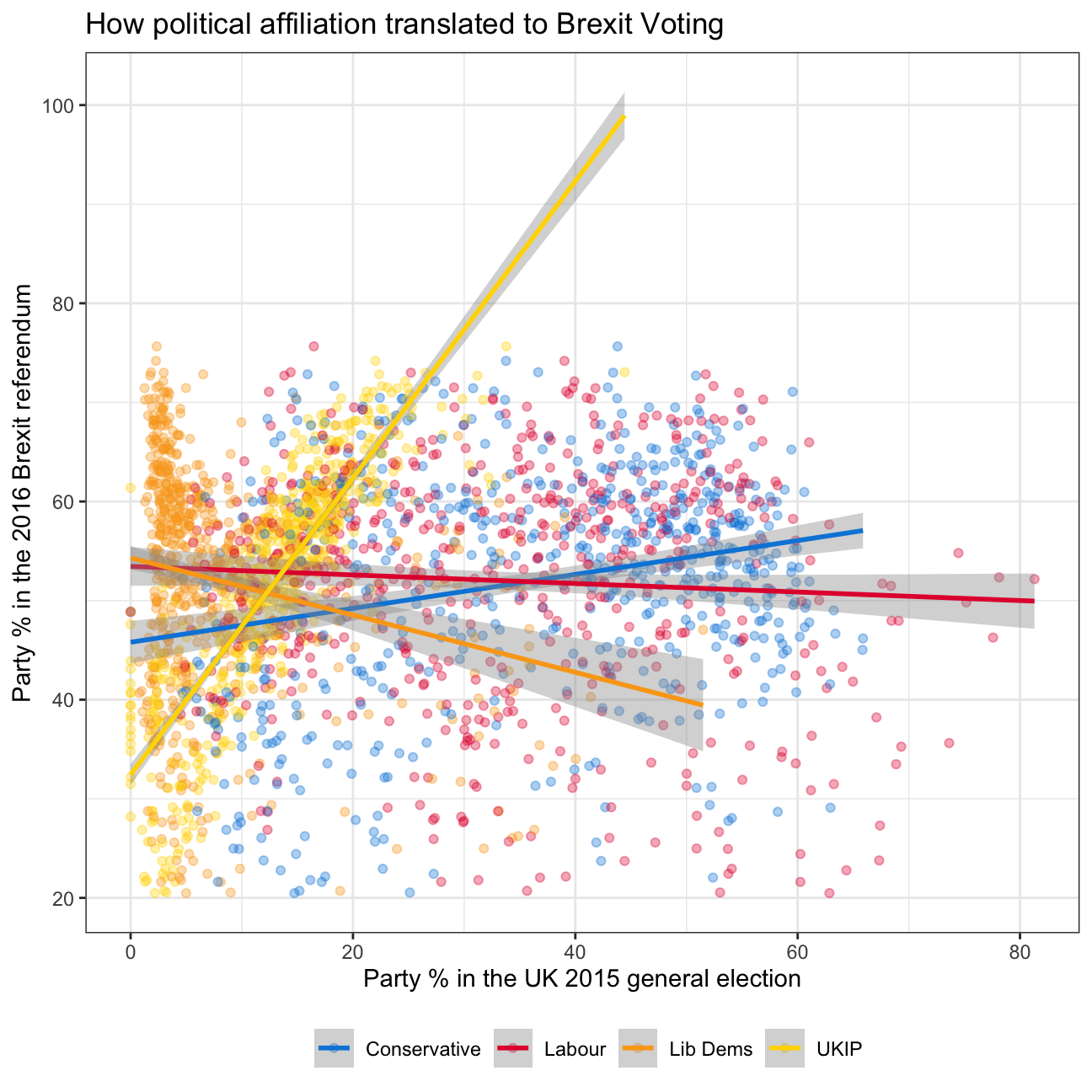
#+ theme(aspect.ratio = 1)Challenge 2:GDP components over time and among countries
We have data from the UN on the GDP among many different countries between 1970 and 2022. We want to test whether the economic definition of GDP is correct in reality. In economics, GDP is the sum of consumption, investment, government spending and net exports. We will be analysing whether that is true for India, the US and Germany.
Below we download and glimpse the data
UN_GDP_data  <-  read_excel(here::here("data", "Download-GDPconstant-USD-countries.xls"), # Excel filename
                sheet="Download-GDPconstant-USD-countr", # Sheet name
                skip=2) # Number of rows to skip

glimpse(UN_GDP_data)
## Rows: 3,685
## Columns: 51
## $ CountryID <dbl> 4, 4, 4, 4, 4, 4, 4, 4, 4, 4, 4, 4, 4, 4, 4, 4, 8, 8, 8,…
## $ Country <chr> "Afghanistan", "Afghanistan", "Afghanistan", "Afghanista…
## $ IndicatorName <chr> "Final consumption expenditure", "Household consumption …
## $ `1970` <dbl> 5.56e+09, 5.07e+09, 3.72e+08, 9.85e+08, 9.85e+08, 1.12e+…
## $ `1971` <dbl> 5.33e+09, 4.84e+09, 3.82e+08, 1.05e+09, 1.05e+09, 1.45e+…
## $ `1972` <dbl> 5.20e+09, 4.70e+09, 4.02e+08, 9.19e+08, 9.19e+08, 1.73e+…
## $ `1973` <dbl> 5.75e+09, 5.21e+09, 4.21e+08, 9.19e+08, 9.19e+08, 2.18e+…
## $ `1974` <dbl> 6.15e+09, 5.59e+09, 4.31e+08, 1.18e+09, 1.18e+09, 3.00e+…
## $ `1975` <dbl> 6.32e+09, 5.65e+09, 5.98e+08, 1.37e+09, 1.37e+09, 3.16e+…
## $ `1976` <dbl> 6.37e+09, 5.68e+09, 6.27e+08, 2.03e+09, 2.03e+09, 4.17e+…
## $ `1977` <dbl> 6.90e+09, 6.15e+09, 6.76e+08, 1.92e+09, 1.92e+09, 4.31e+…
## $ `1978` <dbl> 7.09e+09, 6.30e+09, 7.25e+08, 2.22e+09, 2.22e+09, 4.57e+…
## $ `1979` <dbl> 6.92e+09, 6.15e+09, 7.08e+08, 2.07e+09, 2.07e+09, 4.89e+…
## $ `1980` <dbl> 6.69e+09, 5.95e+09, 6.85e+08, 1.98e+09, 1.98e+09, 4.53e+…
## $ `1981` <dbl> 6.81e+09, 6.06e+09, 6.97e+08, 2.06e+09, 2.06e+09, 4.60e+…
## $ `1982` <dbl> 6.96e+09, 6.19e+09, 7.12e+08, 2.08e+09, 2.08e+09, 4.77e+…
## $ `1983` <dbl> 7.30e+09, 6.49e+09, 7.47e+08, 2.19e+09, 2.19e+09, 4.96e+…
## $ `1984` <dbl> 7.43e+09, 6.61e+09, 7.60e+08, 2.23e+09, 2.23e+09, 5.06e+…
## $ `1985` <dbl> 7.45e+09, 6.63e+09, 7.63e+08, 2.23e+09, 2.23e+09, 5.08e+…
## $ `1986` <dbl> 7.68e+09, 6.83e+09, 7.85e+08, 2.30e+09, 2.30e+09, 5.23e+…
## $ `1987` <dbl> 6.89e+09, 6.12e+09, 7.05e+08, 2.07e+09, 2.07e+09, 4.69e+…
## $ `1988` <dbl> 6.32e+09, 5.62e+09, 6.46e+08, 1.90e+09, 1.90e+09, 4.31e+…
## $ `1989` <dbl> 5.87e+09, 5.22e+09, 6.01e+08, 1.76e+09, 1.76e+09, 4.00e+…
## $ `1990` <dbl> 5.69e+09, 5.06e+09, 5.82e+08, 1.71e+09, 1.71e+09, 3.88e+…
## $ `1991` <dbl> 5.28e+09, 4.70e+09, 5.40e+08, 1.51e+09, 1.51e+09, 4.15e+…
## $ `1992` <dbl> 5.59e+09, 4.97e+09, 5.72e+08, 1.52e+09, 1.52e+09, 4.92e+…
## $ `1993` <dbl> 4.36e+09, 3.87e+09, 4.46e+08, 1.13e+09, 1.13e+09, 4.22e+…
## $ `1994` <dbl> 3.52e+09, 3.13e+09, 3.59e+08, 8.70e+08, 8.70e+08, 3.69e+…
## $ `1995` <dbl> 5.46e+09, 4.86e+09, 5.60e+08, 1.29e+09, 1.29e+09, 6.16e+…
## $ `1996` <dbl> 5.36e+09, 4.76e+09, 5.48e+08, 1.21e+09, 1.21e+09, 6.42e+…
## $ `1997` <dbl> 5.25e+09, 4.67e+09, 5.36e+08, 1.14e+09, 1.14e+09, 6.64e+…
## $ `1998` <dbl> 5.18e+09, 4.60e+09, 5.33e+08, 1.08e+09, 1.08e+09, 6.87e+…
## $ `1999` <dbl> 5.09e+09, 4.52e+09, 5.17e+08, 1.02e+09, 1.02e+09, 7.04e+…
## $ `2000` <dbl> 4.95e+09, 4.41e+09, 5.04e+08, 9.53e+08, 9.53e+08, 7.13e+…
## $ `2001` <dbl> 4.70e+09, 4.17e+09, 4.95e+08, 1.00e+09, 1.00e+09, 6.54e+…
## $ `2002` <dbl> 7.18e+09, 6.40e+09, 7.02e+08, 1.37e+09, 1.37e+09, 9.49e+…
## $ `2003` <dbl> 8.87e+09, 7.89e+09, 9.06e+08, 1.54e+09, 1.54e+09, 1.41e+…
## $ `2004` <dbl> 8.73e+09, 7.66e+09, 1.05e+09, 1.90e+09, 1.90e+09, 1.11e+…
## $ `2005` <dbl> 1.01e+10, 9.00e+09, 1.06e+09, 2.06e+09, 2.06e+09, 1.14e+…
## $ `2006` <dbl> 1.07e+10, 9.34e+09, 1.40e+09, 2.06e+09, 2.06e+09, 1.09e+…
## $ `2007` <dbl> 1.20e+10, 1.04e+10, 1.71e+09, 2.17e+09, 2.17e+09, 1.03e+…
## $ `2008` <dbl> 1.23e+10, 1.06e+10, 1.73e+09, 2.14e+09, 2.14e+09, 1.24e+…
## $ `2009` <dbl> 1.29e+10, 1.10e+10, 2.15e+09, 3.12e+09, 3.12e+09, 1.53e+…
## $ `2010` <dbl> 1.79e+10, 1.57e+10, 2.25e+09, 2.81e+09, 2.81e+09, 1.58e+…
## $ `2011` <dbl> 1.97e+10, 1.70e+10, 2.69e+09, 2.61e+09, 2.61e+09, 1.72e+…
## $ `2012` <dbl> 2.91e+10, 2.59e+10, 2.81e+09, 2.85e+09, 2.85e+09, 1.31e+…
## $ `2013` <dbl> 3.48e+10, 3.14e+10, 2.81e+09, 2.75e+09, 2.75e+09, 8.34e+…
## $ `2014` <dbl> 3.35e+10, 3.02e+10, 2.76e+09, 2.13e+09, 2.13e+09, 1.20e+…
## $ `2015` <dbl> 3.53e+10, 3.19e+10, 2.81e+09, 2.29e+09, 2.29e+09, 9.10e+…
## $ `2016` <dbl> 3.50e+10, 3.16e+10, 2.84e+09, 2.34e+09, 2.34e+09, 7.54e+…
## $ `2017` <dbl> 3.51e+10, 3.16e+10, 2.85e+09, 2.24e+09, 2.24e+09, 7.60e+…We tidy the data to make sure it’s in a long format. We also change the indicator names to be more concise, which helps legibility of the graph legend later. We then plot the data to show the GDP and it’s components over time.
tidy_GDP_data  <- UN_GDP_data %>%

  pivot_longer(cols=4:51,
                names_to="year",
                values_to = "GDP") %>%
   mutate(GDP_new = GDP/1e9,
          tidy_IndicatorName = case_when(
     IndicatorName == 'Imports of goods and services' ~ "Imports",
     IndicatorName == 'Household consumption expenditure (including Non-profit institutions serving households)' ~ "Household expenditure",
     IndicatorName == "General government final consumption expenditure" ~ "Government expenditure",
     IndicatorName == "Final consumption expenditure"~ "Final consumption expenditure",
     IndicatorName == "Gross capital formation" ~ "Gross capital formation",
     IndicatorName == "Exports of goods and services" ~ "Exports",
     IndicatorName == "Gross Domestic Product (GDP)" ~ "Gross Domestic Product",
    )) %>%
  drop_na()

glimpse(tidy_GDP_data)
## Rows: 67,441
## Columns: 7
## $ CountryID <dbl> 4, 4, 4, 4, 4, 4, 4, 4, 4, 4, 4, 4, 4, 4, 4, 4, 4, …
## $ Country <chr> "Afghanistan", "Afghanistan", "Afghanistan", "Afgha…
## $ IndicatorName <chr> "Final consumption expenditure", "Final consumption…
## $ year <chr> "1970", "1971", "1972", "1973", "1974", "1975", "19…
## $ GDP <dbl> 5.56e+09, 5.33e+09, 5.20e+09, 5.75e+09, 6.15e+09, 6…
## $ GDP_new <dbl> 5.56, 5.33, 5.20, 5.75, 6.15, 6.32, 6.37, 6.90, 7.0…
## $ tidy_IndicatorName <chr> "Final consumption expenditure", "Final consumption…# Let us compare GDP components for these 3 countries
country_list <- c("United States","India", "Germany")
Indicator_list <- c('Gross capital formation', "Exports of goods and services", "General government final consumption expenditure", "Household consumption expenditure (including Non-profit institutions serving households)", "Imports of goods and services"
)
tidy_GDP_data_countrywise <- tidy_GDP_data %>%
#
filter(Country %in% country_list, IndicatorName %in% Indicator_list) %>%
group_by(Country) %>%
mutate(year = as.integer(year))
tidy_GDP_data_countrywise## # A tibble: 720 × 7
## # Groups: Country [3]
## CountryID Country IndicatorName year GDP GDP_new tidy_…¹
## <dbl> <chr> <chr> <int> <dbl> <dbl> <chr>
## 1 276 Germany Household consumption expend… 1970 8.72e11 872. Househ…
## 2 276 Germany Household consumption expend… 1971 9.19e11 919. Househ…
## 3 276 Germany Household consumption expend… 1972 9.69e11 969. Househ…
## 4 276 Germany Household consumption expend… 1973 9.97e11 997. Househ…
## 5 276 Germany Household consumption expend… 1974 9.95e11 995. Househ…
## 6 276 Germany Household consumption expend… 1975 1.03e12 1032. Househ…
## 7 276 Germany Household consumption expend… 1976 1.08e12 1076. Househ…
## 8 276 Germany Household consumption expend… 1977 1.12e12 1122. Househ…
## 9 276 Germany Household consumption expend… 1978 1.16e12 1162. Househ…
## 10 276 Germany Household consumption expend… 1979 1.20e12 1200. Househ…
## # … with 710 more rows, and abbreviated variable name ¹tidy_IndicatorNameggplot(tidy_GDP_data_countrywise)+
aes(x = year, y = GDP_new, color = tidy_IndicatorName)+
geom_line()+
facet_wrap(~Country)+
labs(
title = 'GDP components over time',
subtitle = 'In constant 2010 USD',
)+
ylab('Billion US$')+
xlab('Year')+
theme_bw()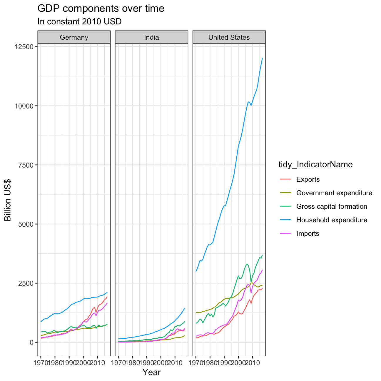
We now start testing whether the GDP from the sum of the components is the same as the GDP in reality. Below we calculate the percentage difference between reality and theory.

##         Country total_gdp_by_components total_gdp percentage_difference
## 1       Germany                   67598     43904                  35.1
## 2         India                   18523     13643                  26.3
## 3 United States                  203255    162771                  19.9
There is a percentage difference of 35.1% for Germany, 26.3% for India and 19.9% for United States

In Germany we can see a downward trend in household expenditure and gross capital formation. The net exports have increased starting 2020 and government expenditure has almost remained the same with slight changes in the middle. In India household expenditure has decreased drasitically, by more than 10%. On the oppostie, gross capital formation has seen rapid increase specially after the year 2000. Net exports and Government expenditure have stayed the same over the years. In the United states, Government expenditure has seen the most change, it has decreased by more than 5%. Net exports have reduced by about 1-2%, while both gross capital formation household expenditure have increased by approximately 2.5%. India has the highest levels of gross capital formation and the lowest government expenditure.